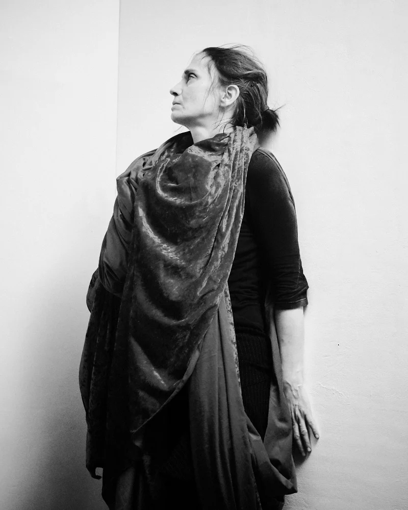
All images taken with the X100, X-Pro1 and the 18mm, 35mm and 56mm lenses.
Part One: Who's Got the Look?
... sang ABC.
Lately I’ve been receiving a few enquiries asking how I get my images to look the way they do. This is somewhat flattering, always a nice thing to be asked. The thing is I wasn't quite sure if it’s a question that should be asked, which is ironic as until recently I always had the ardent desire to ask this of better photographers than I.
The trouble is that when it comes to imagery and vision, one size does not necessarily fit all. I've found that the approaches I bring to my overseas shots of wooden house Americana look faintly laughable when applied to my natural rainy habitat of slate and stone UK. They just don’t fit each other. There are further differences when I leave the countryside for the inner city, which requires a whole other character of processing. And this is without going into the agonising decision over whether to shoot black and white or colour, and which is appropriate for what. The only way you can really nail the right look for yourself is by endless experimentation until something just clicks and you think to yourself, in a somewhat biblical way, "Ah yes, of course, I know your face. You’re the one I had been searching for all along."
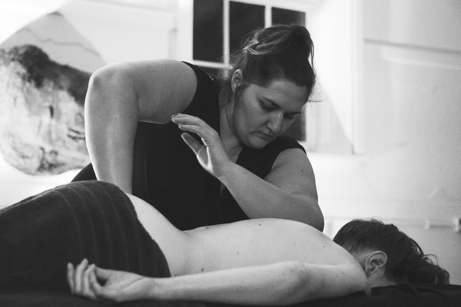
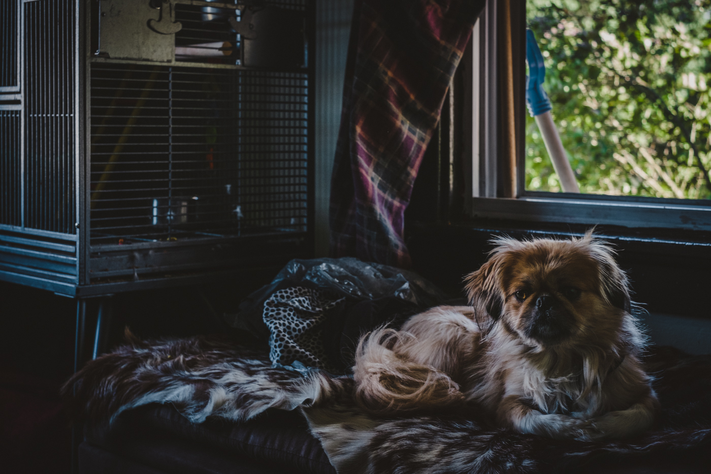
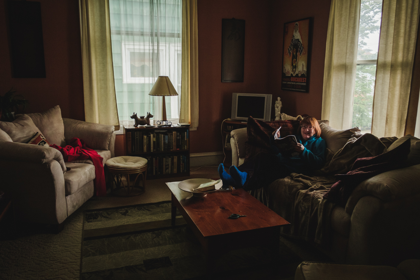
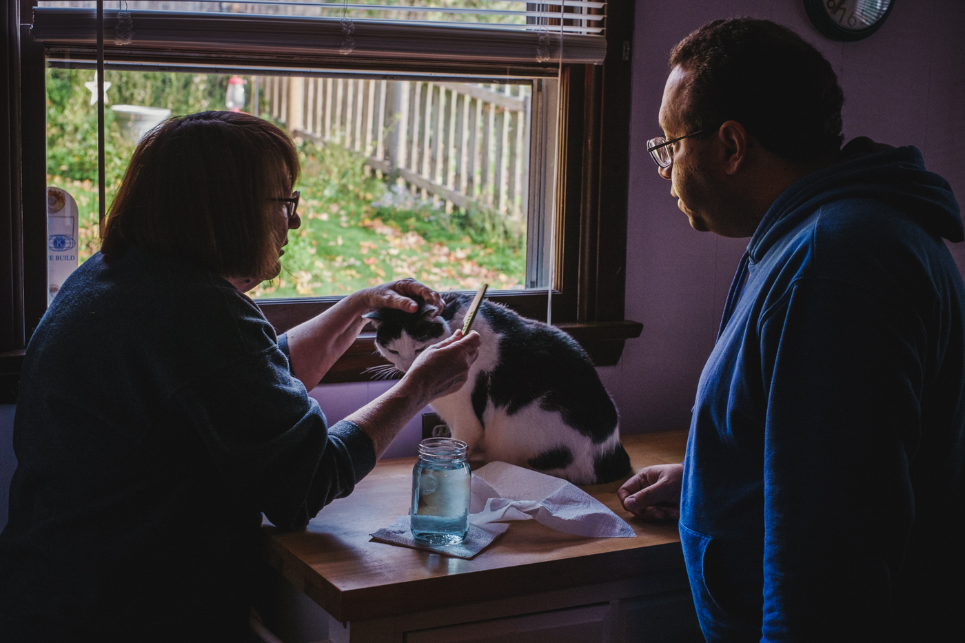
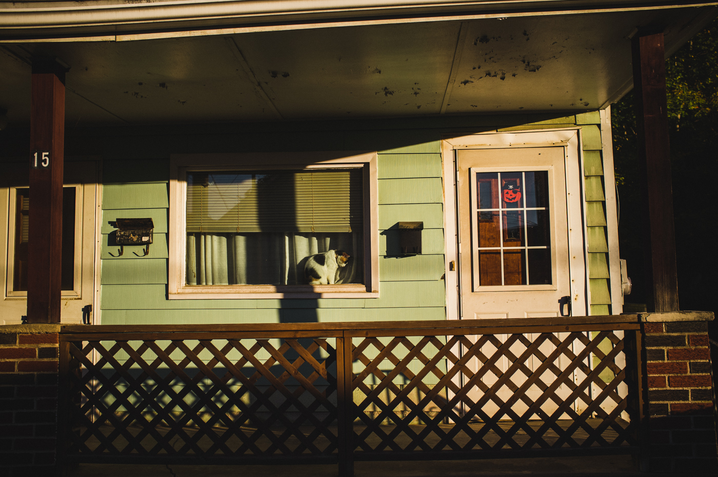
So what do I look for in making my photograph? Let's take the above image, as an example. It's a cosy atmosphere. The light is low, peeking in through the curtains. We have deep rich blacks. Soft surroundings. There's humour and a sort of gentleness to the scene. I looked at it and I wanted to draw the eye in to the things that matter. His face first of all, then the unity of the four hands resting and moving around his head. Moving from the hands the tattoo. Next up you take in the dog - the next living, characterful element in the composition. Those figures gauged, we add a subtler detail to certain textures and shapes. The creases in his jeans. The wax candle jar and beverage. The cobwebbed cushion design and the well-worn plushness of the sofa arm. I took these elements and filtered them through my memory, and the look of my favourite films and paintings - and there's the result.
The fact that we have to strive for our own vision is a lesson it took me time to learn. To quote the sage words of the wonderful photography podcast On Taking Pictures, ‘there is no secret sauce.’ We’re all cooking different meals here; it’d be somewhat rum if we all used the same recipe. It's why I don't feel entirely confident in passing on my developing tricks. After all, who am I to preach how to tinker with images taken in Australia, or Madagascar? I've never even been there.
Now at this point I suspect you’ve all lifted small pebbles and stones from the ground in an eager bid to shy them at me and stop this blithering equivocating drivel. Well, quite. So rather than risk a black eye I’ll try to answer your processing questions as best I can, especially as regards to the whimsies of the X-Trans sensor. But there’s a price to pay. You’re going to have to listen to me go about inspiration and purpose a bit. Because without those two qualities aiming to achieve any sort of look in post-processing your photographs makes about as much sense as dumping a large wad of cash on Michael Bay’s lap and asking him to do an adaptation of Samuel Beckett’s ‘Waiting for Godot.’
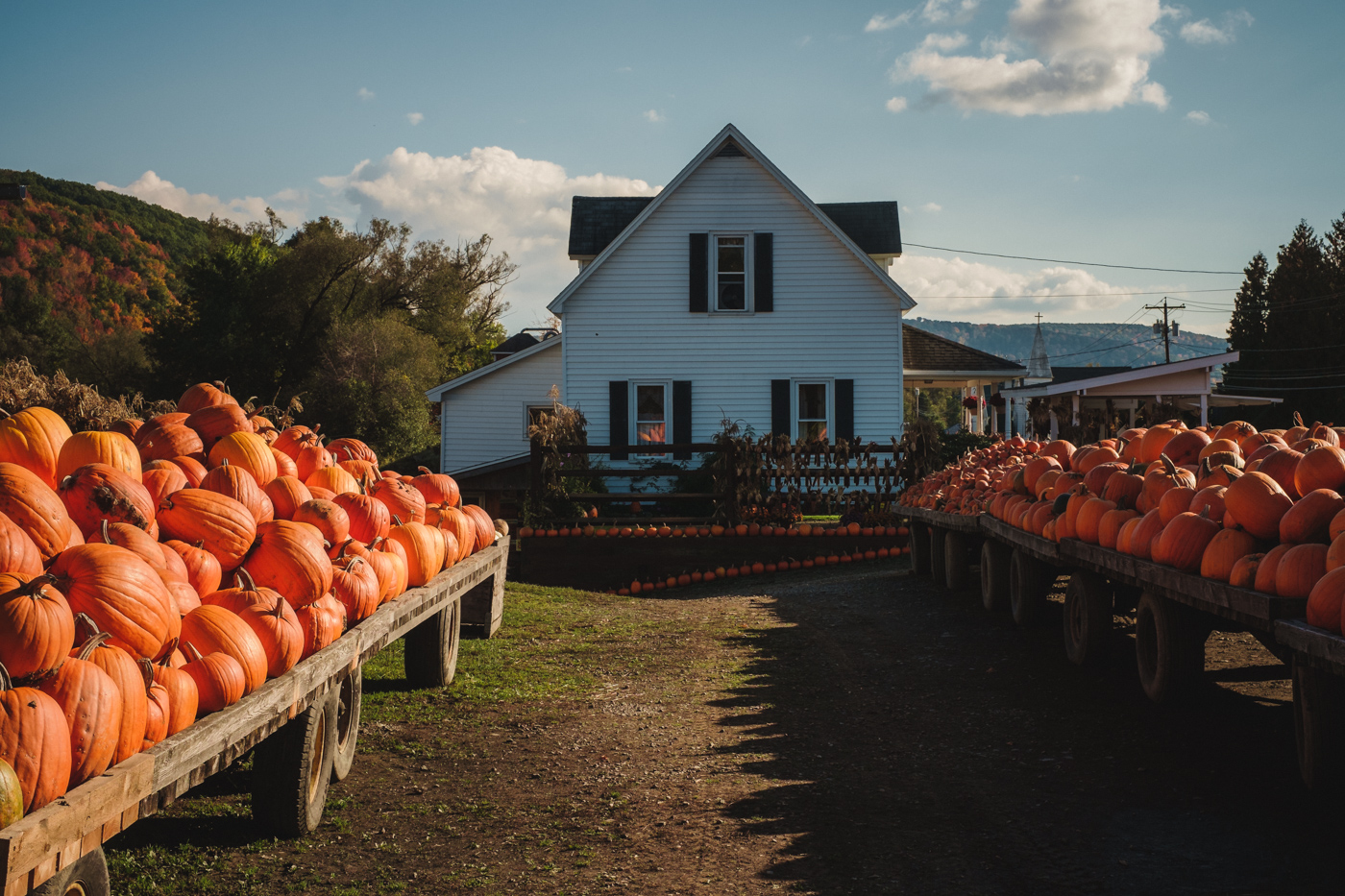
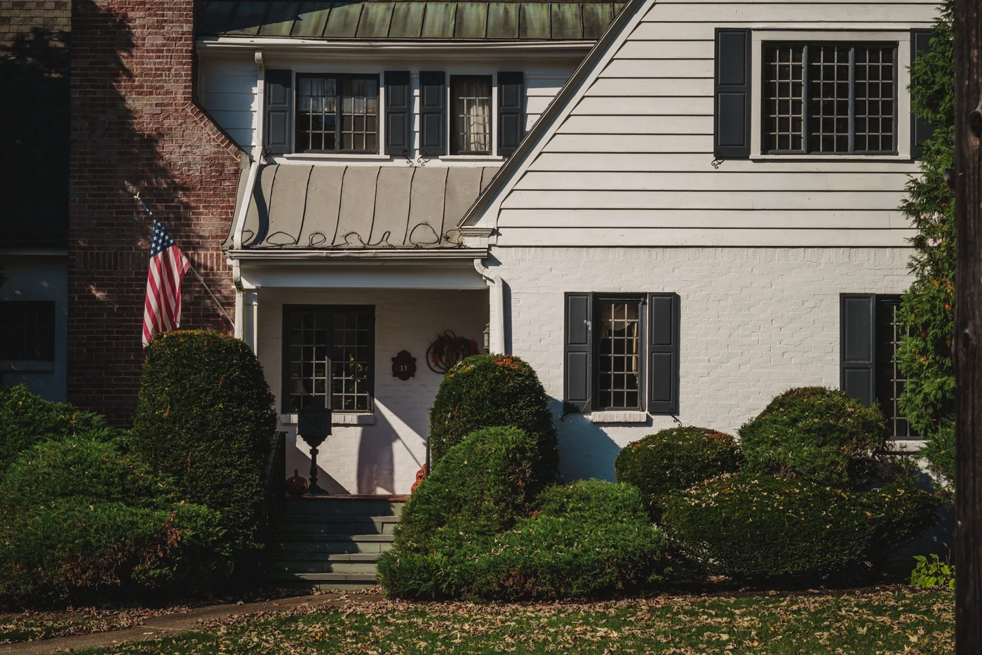
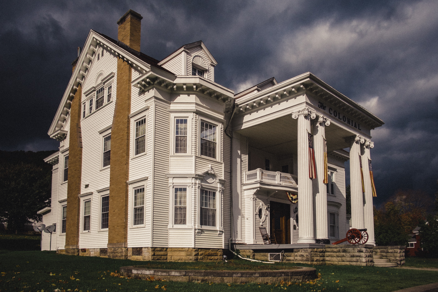
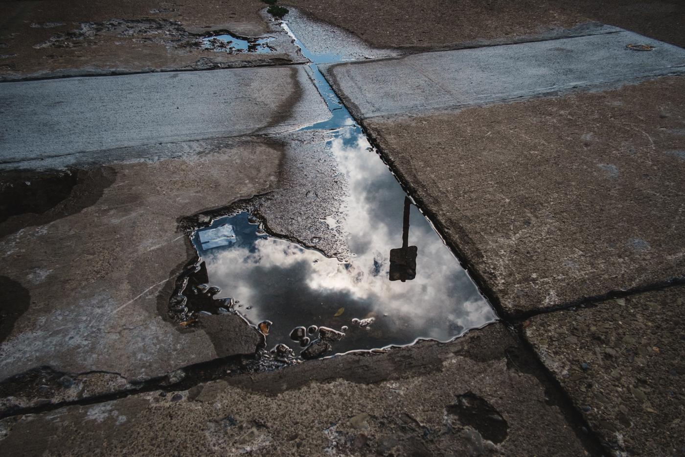
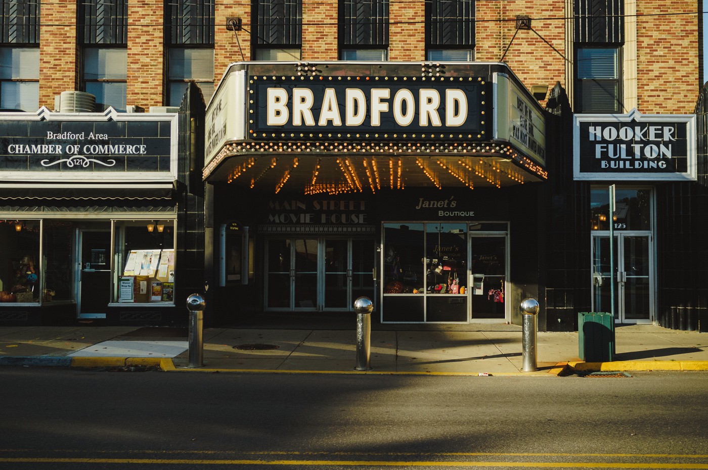
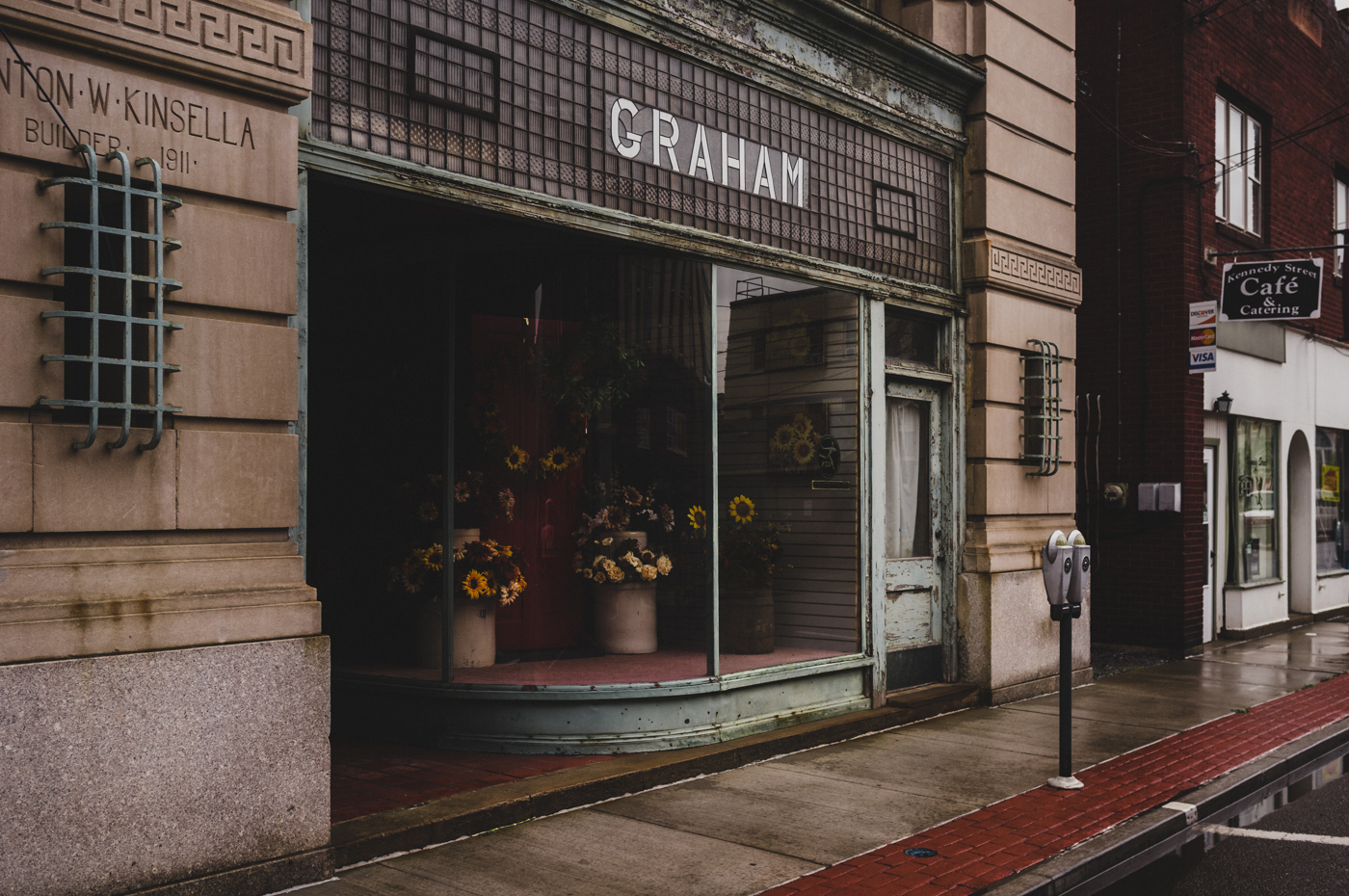
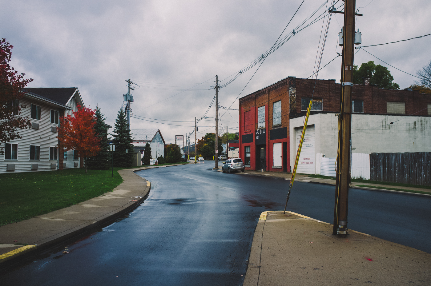
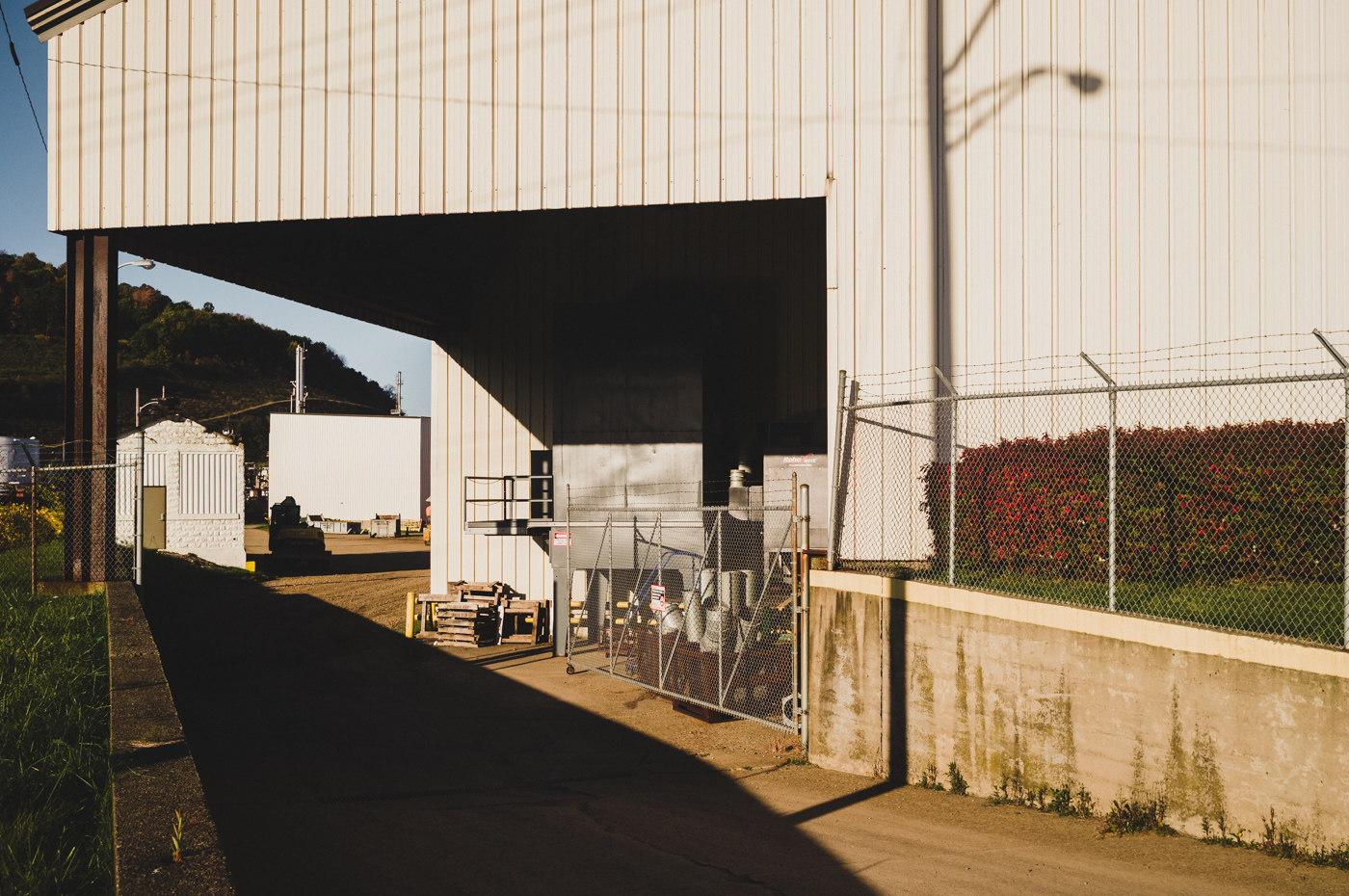
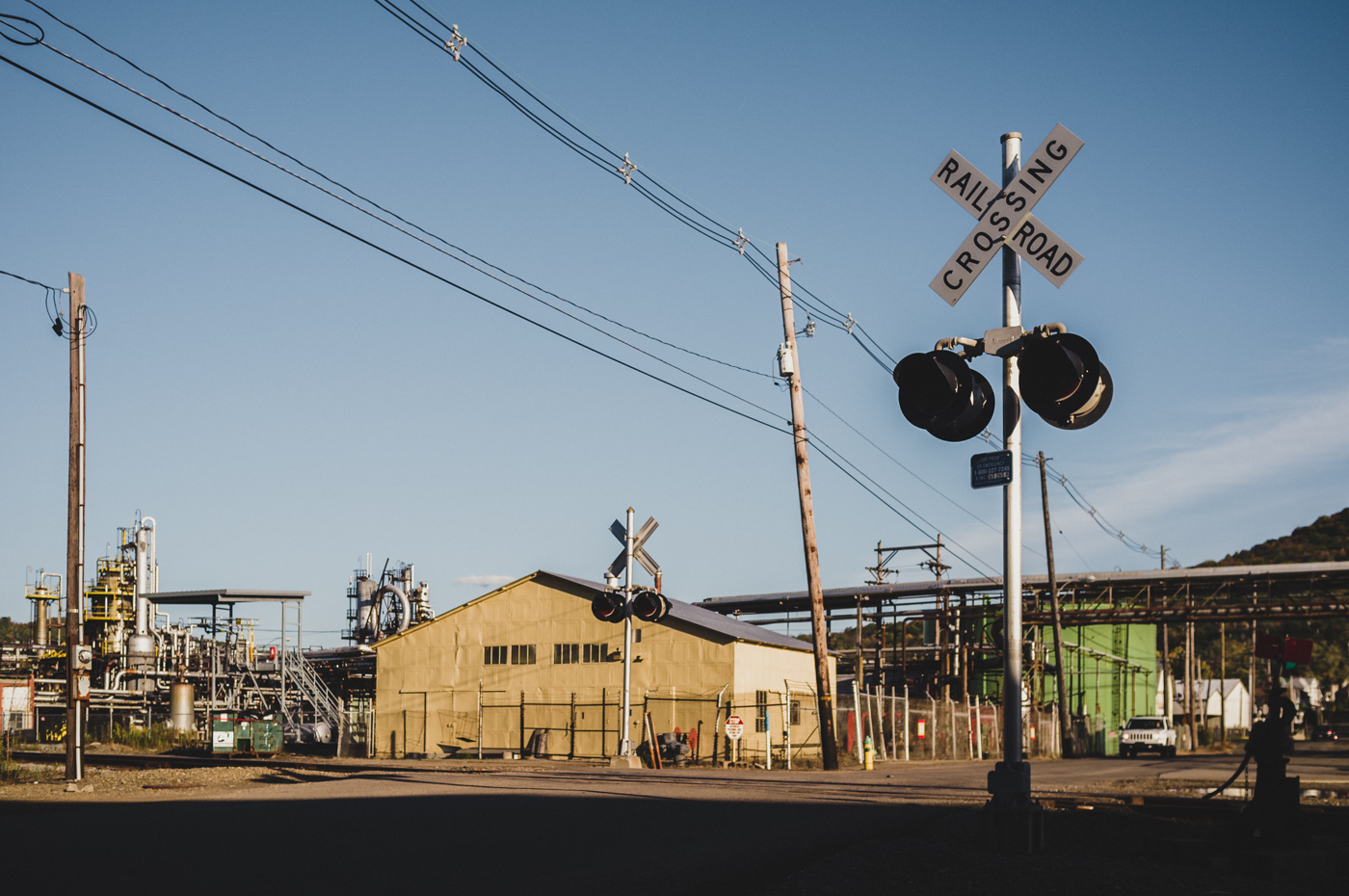
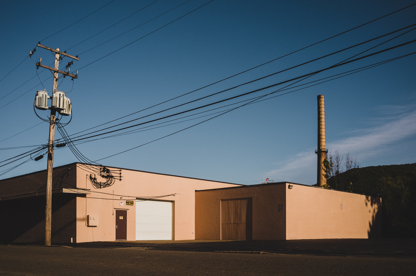
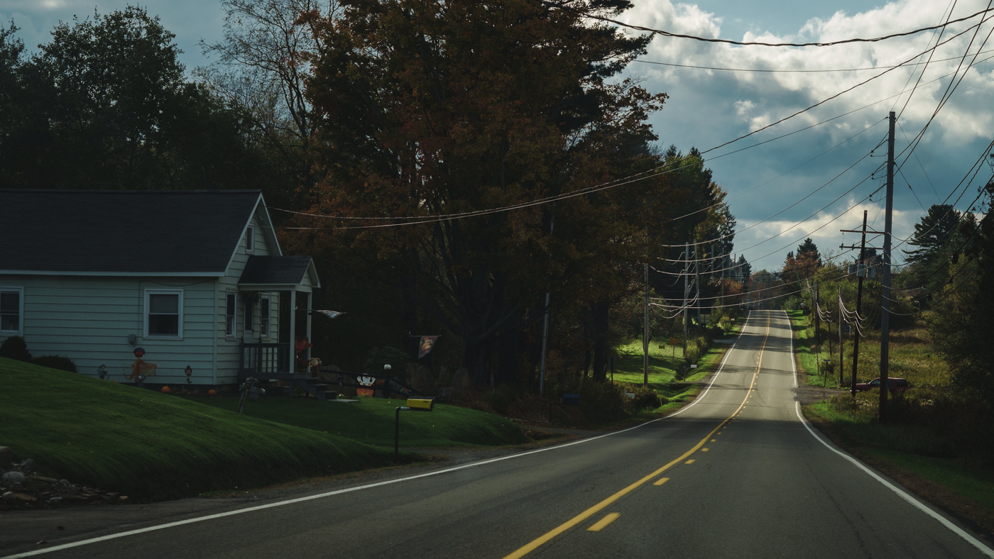
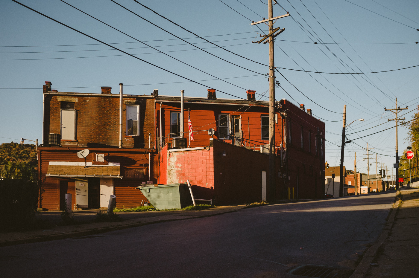
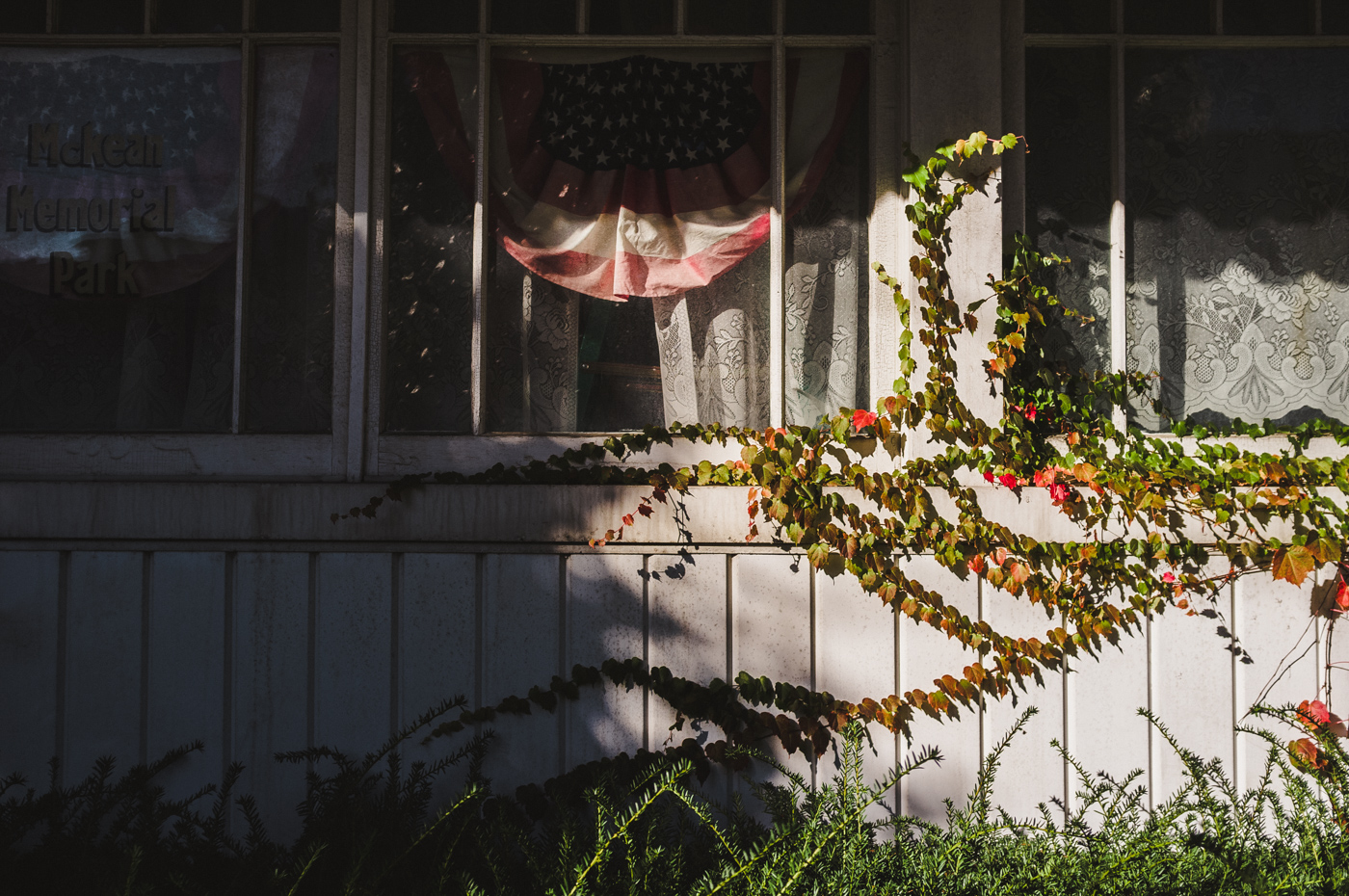
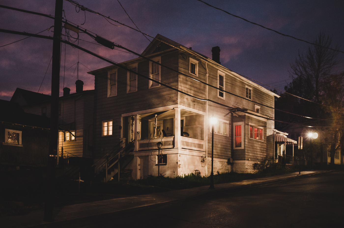
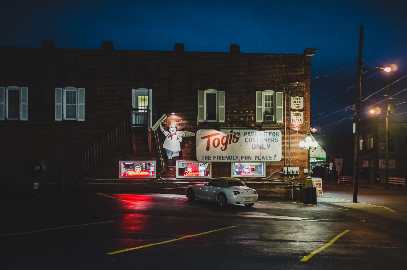
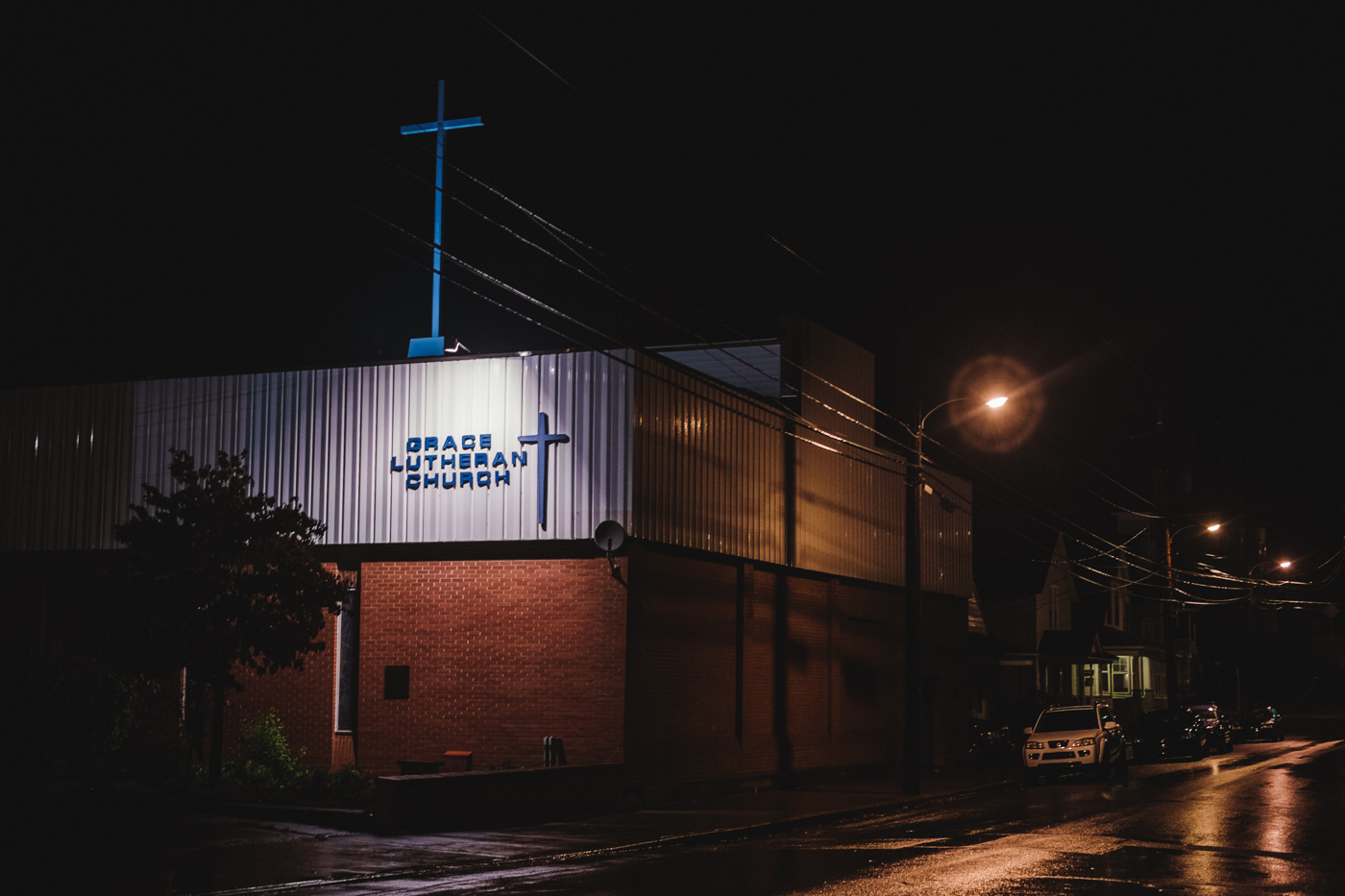
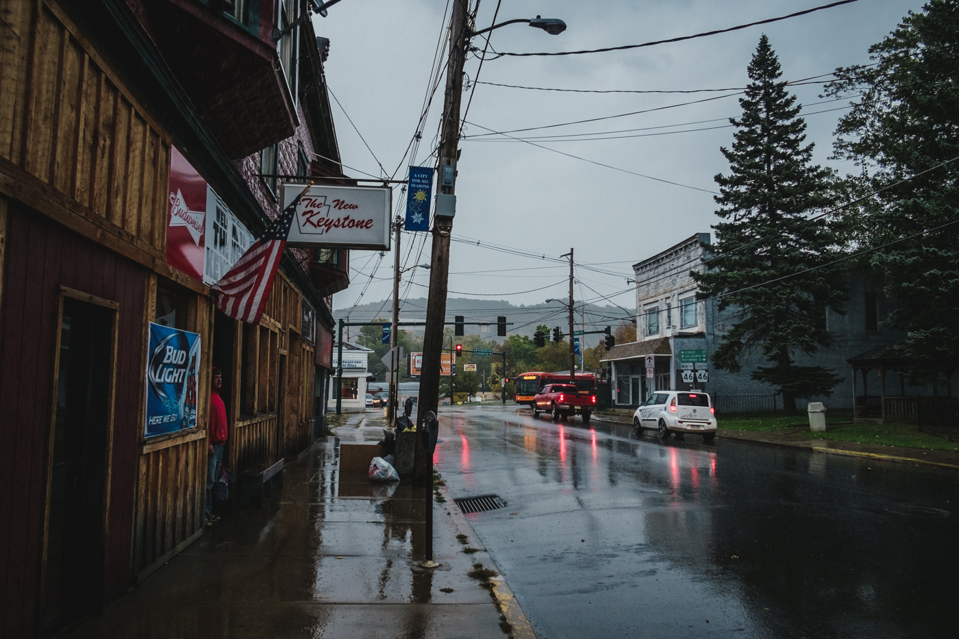
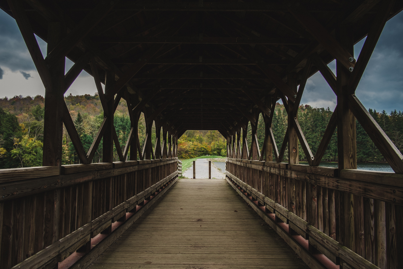
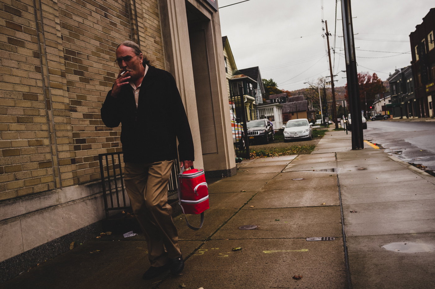
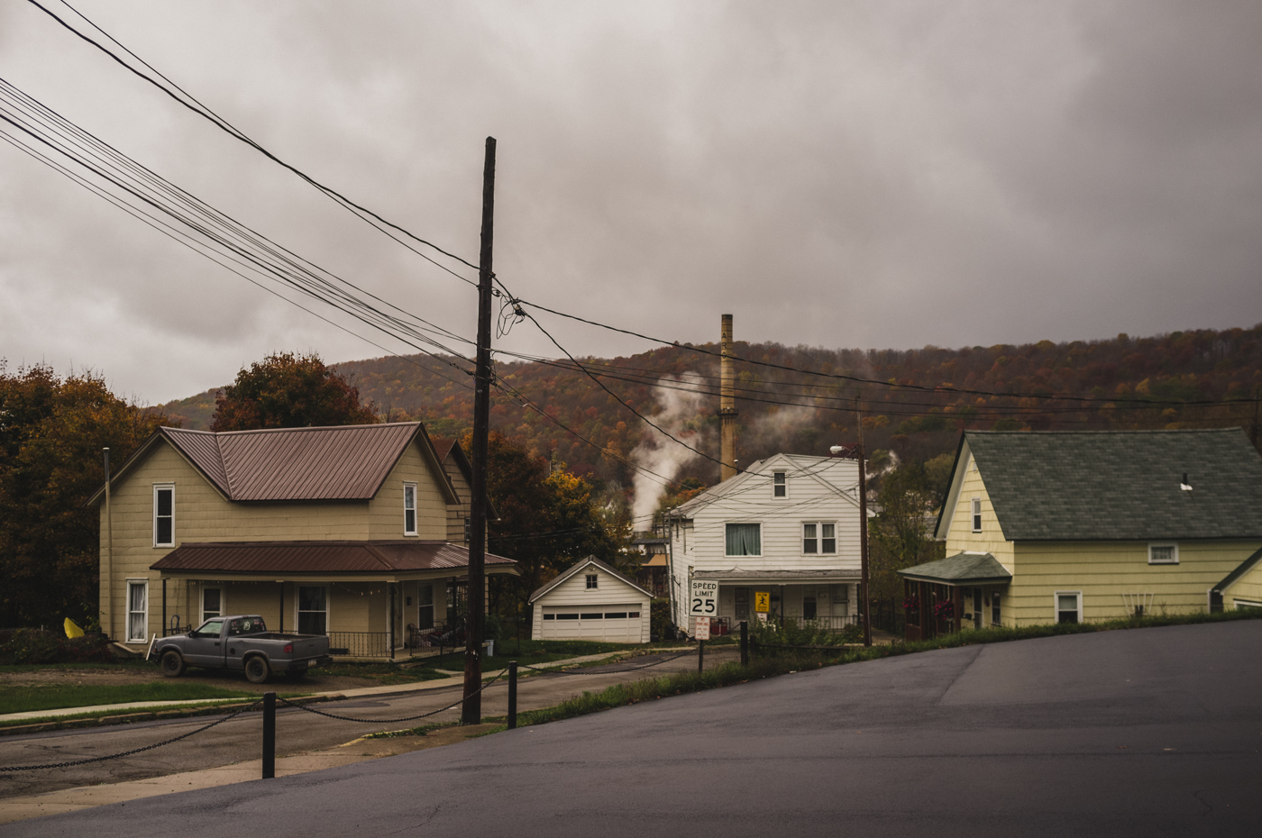
Nethertheless, I'm hoping that my next batch of images from small town America will see you through this somewhat word-heavy post. They're something of a medley of off-cuts as compared to the more focused themes I've been putting up of late. All the same, I hope you enjoy 'em. All the images were taken in Pennsylvania and are keeping with my vision of the character of the place. Whether that might be an accurate vision or not, is up to you to decide. But I hope you'll find them interesting all the same...
Part Two: Kill Your Swans!
Sounds a bit extreme I know, but this is an important step. Upon the purchase of a new lens do you find yourself wandering down to the park and taking photographs of swans? Perhaps there is a jetty, or its bigger brethren the pier nearby, and you take photographs of that instead?
Friend photographer, you must bludgeon those swans on the head, you must burn down that pier, rather than raise a camera to take that photograph. I’m looking at you, Amateur Photographer readers. You've got to figure out what you actually want to do photography for. What fascinates you? What sights suddenly stop you in your tracks and make you yearn to record a special moment, or a fleeting impression, or a strangely mesmerising sight – no matter how banal on the surface? What do you want to say? What do you want to show to people as you grab them by the lapels and scream, look, look I say! If you can’t express yourself, if you can’t feel an image, you can’t really find your own vision in post-processing.
Though if photographing piers really is your thing then by all means go for it, I wouldn't want you to succumb to any unwarranted pressure on my part.
Must. Avoid. Puns.
Anyway, it’s here that studying up in photography really pays dividends. My first love was Stephen Shore. I had no abiding interest in photography until I casually picked up his book ‘Uncommon Places’ and was immediately transported to another world. A world that existed some place between 1970’s America and the strange romance I’d built up in my mind as to his life on the road, cruising around small town America, taking seemingly banal but iconic shots in gorgeous light – living in motels and driving, always searching. I wanted to do that, desperately. I read further, discovering his contemporaries and people he influenced, eventually leading me to Fred Herzog and William Eggleston, Alec Soth and Joel Sternfeld and Vanessa Winship. I became addicted, following up with the black and white work of Walker Evans, William Wright Morris, Gordon Parks, Dorothea Lange and Robert Frank. But most of all I loved the look of Shore's images. That tawny light. The way skies and shadows looked. The colours.
The above names might just be unknown names to you, in which case drop everything and pick up Geoff Dyer’s ‘The Ongoing Moment’, which is the only book about photography that you ever need to read. It’s also very funny and beautifully written, which helps. Yes, books are great. Ever read any of Eric Kim’s blog? There’s something he keeps going on about, and that’s about how you should buy photography books instead of gear. Apparently devouring such great work will make you a far better photographer than grabbing the latest bit of kit. Wise words, but I say – why not have your cake and eat it? Visit your local library, if you’re fortunate to have one, and pile through the books there. Ask a friendly librarian and you can usually order books in too. If you have no library due to philistines and their budget cuts, see if you can form up with a local photography group and share books. Beware groups that call themselves ‘Camera Clubs’. They usually just meet to talk about gear and take photographs of swans and jetties.
Once you've exhausted the work of the photographers who speak to you the most, it's time to dig even deeper and search out different visions. Get a Magnum book and a Life Photographer compendium and start mixing ingredients. Better than that, explore even further outside photography. The natural next step for me was to dig out books featuring Edward Hopper, Norman Rockwell and American realists. Then I remembered I dearly loved the English artist L. S. Lowry and his ‘matchstick-man’ industrial town landscapes of Northern England. Such grey, lowering skies and rain-smudged moments of colour! Move on to movies. Terrence Malick’s ‘Badlands’ was a huge influence on me, as was ‘The Last Picture Show’ and David Lynch’s ‘The Straight Story’ - and of course, 'Twin Peaks'. Even music as you tinker with your images can have a subtle effect, and imagined worlds from the pages of books can encourage you to seek something you hope – or even dread, might be out there. Even my beloved childhood picture books illustrated by Shirley Hughes gave me material to draw on.
As you process all this stuff you’re unconsciously creating a world inside your head and populating it with people and places you've seen only through the eyes and imagination of others. Get really into it and you’ll find yourself itching to find things to look at, to really define with a captured moment, and through post-processing create your own version of a reality.
Then you’ll find yourself emptying your pockets over plane and coach tickets, rather than new lenses. You'll spend your time researching potential projects instead of ploughing through camera gear reviews. Shoot with purpose. It’s tricky I know; I’m far from being a paragon of this. But I did have an illuminating chat with Magnum photographer David Hurn and he argued quite convincingly that the most important thing in developing as a photographer was in pursuing long term personal projects, ones that meant something to you, above all else. They don’t have to be epic; they can take place in your own backyard. Mark Cohen rarely strayed from Bethlehem, Pennsylvania, and he created a unique body of quite compelling and unsettling work featuring his own hometown.
Part Three: Finally. My Recipe.
First of all you might want to check out the preset packages by VSCO and Totally Rad, among others. It’s a valid temptation and something I can recommend. In fact, I recommend dabbling in at least one package. They provide great learning tools. As you tinker with their preset settings you can pick up a great knowledge of how they shift the look of an image. By applying film simulations in line with the stocks used by those classic photographers you’ve fallen in love with, you’ll find some added inspiration and confidence in realising that you’re already part way to sharing their vision. Personally I use Totally Rad’s Replichrome, I especially like their black and white simulations. But they’re both equally good.
Okay, now on to the meat and potatoes of this post. First off, if you use a system other than Fuji, you’ll find that anything I'm going to say relating to sharpening doesn’t really apply at all. X-Trans sensors use a different sharpening system to Bayer sensors, I think they call it discombobulating or something. The splendid Pete Bridgewood hit the nail on the head when he said that racking detail all the way up to 100, and going relatively easy on the actual sharpening strength and radius, seemed to garner the best results from Fuji X-Trans files. Mileage may vary, but that seems to be the best way in Lightroom. You’ll find things different again in Capture One and Irident, packages which some argue get you better quality images. I haven’t tried them, but I’m honestly happy with Lightroom. Is it perfect? No. But I’ve never believed in pixel-peeping and I’ve seen examples of Lightroom images as fairly big prints that look just dandy. So don’t worry about it.
Now, how do I approach my images? For me I prefer to look beyond outright realism and capture the memory of the thing instead. There’s no true look to anything really and if you want perfect accuracy you won’t really be fussed in how I process, rather you’ll only be fussing over white balance and the most neutral of camera profiles.
Firstly let’s take a look at the camera profiles I use. Replichrome and VSCO get you a whole raft to choose from, but I mostly use the native Pro-Neg Hi. (In future I’d like to get a camera worthy of Fuji’s Classic Chrome profile, but until then Pro-Neg Hi it is.) When I don’t use that setting – such as with my X100 – I usually go for the camera's Astia setting or Replichrome's Kodak Porta 400. All the images you see here use several variations on an Americana preset that I've developed, mostly using the above film simulations as a base. When going for black and white, I like Replichrome's Kodak 400 BW.
The first thing to do after lens corrections is to adjust the white balance. Don’t be concerned too much about accuracy, rather try to evoke what you want to show. I have two variations on my presets; a sort of ‘cloudy-slightly-warm’ and a ‘slightly-cool-daylight-winter.’ I find the shade setting a bit over-powering in white balance, tweaking the sliders slightly from cloudy or daylight does the trick. Just try to keep it consistent over multiple images. You’ll also find that white balance affects colour richness, the look of which – dull or vivid - you’ll want to determine over accuracy. I like my shadows so I tend to push my contrast up to around 25. For misty days I might draw it way down for a more ethereal feel.
Regarding exposure I usually have my images underexposed a little, purely because of the look I want to give the places I photograph. The rust belt towns of Pennsylvania to me would look strange given an airy, sunlit feel. Sometimes I do try for that, with a rare blue sky, but mostly I love the added close atmosphere of a lowering sky.
Next up I adjust the sliders. For my images, highlights go way down. Most times it’s dragged kicking and screaming down to nigh on -100. The white slider usually is pushed up a little to leave some room for tonality. Why the highlight nuking? It improves the richness and beauty of the colours I find. It also makes the skies more interesting. If you want to keep in any nice glinting effects on the rims of hubcaps or the tops of parking metres, you can always add them back in with the adjustment brush. You might need to brighten faces a little after using this method, though it has a nice effect on weathered faces too.
Shadows and blackness depend on what I’m capturing. If it’s an overcast scene I push them up a bit, perhaps only pulling black down if I’m getting some mysterious inky shadows in doorways and windows that I want to emphasise. But if it’s an evening and we have strong shadows about the place, well I’m happy to pull them down a little. But primarily I use the tone curve to really set the contrast of my images.
Now for saturation and vibrancy. Typically I get the richness I want from pulling the highlights down, and I usually want my colours a little less demanding on the eye. I find them plenty rich enough with vibrancy set to about -15 and saturation -5. If I want a colour boosted for effect I’ll use the HSL panel, or an adjustment brush. A little goes a long way remember, and always try to take into account how the image will be viewed. Screens can vary in vibrancy, with tablets and smart-phones punching up colours. Likewise a print will always yield far more colour than you expect, so make sure if printing you activate soft-proofing and hit the J key. Don’t worry if they end up looking a little dull, when the images come back from the printer you’ll find them gorgeous enough. (Don’t forget to treat offending colours with adjustment brushes in soft-proof mode, rather than universal changes. You can preserve a lot of the original richness that way.)
Tone-curves next. I’m a great fan of a modified S curve that gives a slightly filmic feel. This works very well when combined with the native filmic look of an X-Trans sensor, and oddly enough doubly so with the original X100 Bayer sensor. If you click the curve setting to RGB you’ll find you can drag the end points. Drag the lower left point up a little until the shadows look slightly – just slightly – cloudy and mysterious. How much is entirely up to you and the intent of the image, but don’t be afraid of losing detail. Indeed, never be afraid of crushing blacks if you want to. Sometimes less IS more and great intrigue can be added to an image by what you can’t see, rather than what you can. For extremes of this check out the wonderful work of Saul Leiter, Bill Brandt and Daido Moriyama.
The rest of the curve I keep a little shallow at the lower end, rising more steeply in the middle and flattening out just slightly at the top. With strong window light you can get a nice effect sometimes by pulling just slightly down on the top end to clip some highlight detail, too. Greater control can be found by selecting the tone picker tool (a little cross-hair) and gently dragging up or down on a highlight or shadow you wish to alter. This is a fantastic way to add a little local contrast to shadows mixing with splashes of light.
Now for the HSL panel. You’ll find sliders for Hue, Saturation and Lightness. As with tones in the tone-curve panel, you’ll find you can adjust specific colours by selecting the cross-haired picker icon, clicking on a relevant spot and dragging gently up or down. With skin tones I generally adjust the lightness, dragging the corresponding reds and yellows up a fraction. Sometimes in a chilly scene I’ll desaturate them just a touch. For skies I like to darken the blues and desaturate them slightly. I rarely adjust the hue. I find too strong a blue sky can overpower the scene, so usually I pull them down quite a bit by about -30 in saturation and half as much in lightness. I treat overcast skies with less of a heavy hand though, the highlight adjustment usually takes care of them. The greens of vegetation I’m usually fine with, but if I have any problem it’s again usually a concern about over-saturation. Sometimes I’ll obsess about hue. An ornamental lawn should look fresher than some scrub ground, so I’ll sometimes shift the points just a smidgen to emphasise the sort of locale and atmosphere if need be. You may find yourself tinkering with yellows and oranges regarding brickwork too. Knock yourself out!
Now for sharpening. Pretty simple really. The Fuji lenses are already damn sharp, and if you slide detail up to full it fixes Adobe’s inclination to soften everything X-Trans sensor shaped. Detail maxed, only raise the actual sharpness amount by a little. I’m talking 30-35 with 40 at the maximum for slightly softer lenses such as the cheaper zooms and the 18mm. Please don’t go any higher than this. You really don’t need it. It’s an insult to a Fujinon lens. For radius, 0.8 is good for intricate landscapes. You’ll find 1.2 – 1.5 good for punchy portraits and architecture. Again, less is more and make sure you keep away from halo effects by going overboard with this. With the Bayer sensor I usually keep detail around 10-25, and with some primes from other companies, such as my old Nikon stuff, I sometimes cautiously push the sharpness up to 45.
Finally I’m a big fan of masking. I don’t believe everything should be sharp, only the important edges. I ramp mine up to quite high, even with landscapes. This can pick out rocks and paths nicely, leaving a pleasing rich tonal smoothness to the grass and foliage, whilst still leaving some sharpness. Pete Bridgewood recommends sticking around 10% most times, but for me – sick puppy that I am – I like to ramp it up to 50% for landscapes, and 80-90% for portraits. Holding down the control key as you do this is a great way of fine-tuning. Push the slider around until you see hollow boxes made out of brick work, and only the nose, mouth and eyes left in faces. Yum. You see, there's a plasticity to early film that I really enjoy. Gordon Parks had some beautiful Kodak moments in colour, and it almost looks as if the people and objects in his shots are thickly edged, with surface detail pretty low. I really dig this look. It goes against all the rules that say that every little hair and leaf should be super-sharp, but I want people's eyes drawn to the content, not to the texture. Hence the heavy masking and low detail, and with architectural and industrial landscapes I sometimes really push that radius up to as high as 1.5-2 to get a real punchy look.
Noise? Seriously, don’t worry about it. With these sensors I find setting it to ten is more than enough even in most noisy scenes. The Fuji X-Trans noise is akin to a pleasant natural filmic grain. In fact, in the absence of it I usually add a dab of grain to make up for it. Nothing showy, a tenth on each slider. A hint of vignette usually completes it. And don't be afraid to hit those gradient and radial filters! They’re pretty wonderful. Frequently I’ll add a gradient to the road in the bottom of an image, right up to the camber, or enhance a shadow. Surrounding a face or body with a bit of radial filter burning and softening is a good trick too. Don't fret too much about realism, atmosphere comes first for me.
The best thing you can do is with local brush adjustments. These can be used to excellent effect in leading the eye to where you want it. With colour I like to work on fire-hydrants, advertisements, coats and flaking paint – any isolated little spots of richness. Yellow lines on blacktop are great for this. For distracting strong colours away from the focus of the image, especially near the edges, I mix them down a bit to make them less demanding on the eye. Then there’s dodging and burning. There’s nothing like adding depth and interest to an image than by picking out little details with a bit of brightening or darkening. I usually like to lighten kerbs, air vents, doorknobs, clock faces, shutters and roller blinds. All of these get a little dose of clarity too, no more than a fraction. Conversely, darkening windows, shadows and vegetation also yields reward and I find that darkening road surfaces and pools of water improves texture and just, y’know, works.
After all this you should have a plum image – if the original one was enough to hold interest, anyway. I work less on portraits, there’s a lot of natural character there that you don’t really want to mess too much with unless you really know what you’re doing – which I don’t yet. But for my favoured mode of topographical shooting of commonplace scenes way out there in small town America, I find this sort of picking away at details and filmic rendering really rewarding.
I want to make these quiet places epic. To take photographs of places and situations that have a quiet strength and mystery about them; a certain character that reflects on the inhabitants and that draws you in and makes you want to step into the photograph to explore their lives and their surroundings. These qualities might not be apparent when you first fire up the image in Lightroom. But don't be disheartened if the original image looks flat and dull, the wonderful magic of post-processing coupled with imagination can push these images in fascinating directions. These aren’t hard and fast rules remember. Feel free to mess with what I've said. And never worry about ruining an image, you can always make snapshots of different settings and return to earlier versions and back again, or tinker with virtual copies.

Phew, that was a bit of a read. I hope all this helps. Remember the most important thing is to think about what you want to show, to think of the emotions or feelings you want to convey. Then mess with it until it does – but mess with purpose. You've got to use those sources of inspiration and picture in your mind that perfect image by the photographer you want to be, an image that tugs at your emotions - negative and positive - and then work to match that richness. And don't worry if it doesn't look real, so long as it doesn't look fake.
If you’ve read all of this, thank you for doing so and not for example throwing me in the basement. Feel free to ask any specific questions in the comments below. Happy tinkering!