Images taken with X-Pro1, X-Pro2 and X100 with 56mm, 35mm and 18mm lenses.
Once upon a time – around six years ago in fact - I was doing some shelving at the local library in the arts and humanities section. It was a new section to me and as I hit that sweet, sweet Dewey Decimal number of 779.92 I pulled a big photography book out from the trolley, ready to shelve. I paused. Beneath the peeling sheen of the protective plastic wrap was a picture of a parking lot in a Mid-Western town, beside a street dominated by a sign reading Samibo’s. The sky was cloudy, the colours faded, the scene devoid of shadow or drama. Yet I was drawn in. I flipped the book open and began to skim through the pages. A glance at the clock, half an hour until lunch. I knew then what I would be reading over a sandwich.
The book was Stephen Shore’s Uncommon Places. If you go right back to the beginning of my blog in the archives, in one of my very first posts, I enthuse at length about it. It’s the book that got me into photography and remains a strong inspiration in my photography. From that time onwards I went from attending photo exhibitions to volunteering at galleries, buying dozens of monographs by great photographers, trying to figure out how to make images I could look upon with real satisfaction. In the previous post I talked about how shooting with Fujifilm’s custom film profiles can put you in mind of trying to see through the eyes of a photographer who inspires you. In this post I want to talk about that process further, about what happens before you even raise that camera to your eye. The key ingredient to learning how to write or direct a movie is to read a lot of books and watch a lot of movies. Then you can study them, take them apart and try to figure out how the writer or director did it. I feel in a way it’s the same with photography. You have to build that reference library of photographs within your head, an index of images ready to be recalled from memory, triggered when your eyes fall upon something that sparks an association with a great photograph, a great photographer.
For myself there are, or were, three working in colour who essentially reprogrammed how I saw things. The aforementioned Stephen Shore, Joel Sternfeld and William Eggleston. All made colour images of America that through film alchemy transmuted the banal into the beautiful. What's more, they began to make me see an odd beauty in the commonplace also. Of the three though, it's William Eggleston who most affected me in his use of colour. I had his book, William Eggleston's Guide, which I consider pretty much a bible for colour photography, and collection of his titled For Now. However it was an exhibition of his portrait work in gorgeous large dye transfer prints at the National Portrait Gallery in London that really stretched my eyes. They had a luminosity and richness that was quite incredible. Returning from the exhibition I devoured those two books all over again, and looking through my own images subsequently it was reaffirmed to me how much I took inspiration from him.
In this post I want to show how he made me think differently about the sort of images you could make. Because although having custom profiles can help you see the world differently through an electronic viewfinder, it’s really when you begin to find yourself consistently seeing the world in a different way, before you’ve even raised the viewfinder to your eye - well, that’s when things begin to happen. That’s when you begin to see in Kodachrome, that’s when you begin to see things in terms of Eggleston...
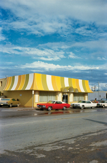
The main thing that struck me about Eggleston's work is how could he balance seperate elements of colour against each other. An image of his shows a layer of blue and white skies, then the industrial sunshine-yellow of a diner roof, followed by a pop of red in the fast car parked alongside... and then, beneath that, a wide swathe of grey road that controls the explosion of colour, provides a space to take each seperate colour to define against the asphalt, see how it tastes.
Then we have his Esso photograph; a bed of green supporting a blue sky, and then an oval of black, white and red in the Esso gas sign. Against that, on the right, a rectangular block of aquamarine bridging the gap of green and blue and on top of the roof of this structure, a rusty car perched, as if poised to throw a circus trick and take the leap across and through the sign. Look closer, two African American men sat on a white car, one sports a mustard-yellow tank-top. Everywhere the lines of fences, telephone wires and posts intersect the scene, split it up, allowing each element to be swallowed individually and leading into another. It's just an incredible photograph, and one that I'm always looking for an equivalent of in my expeditions.
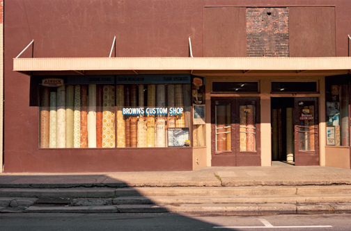
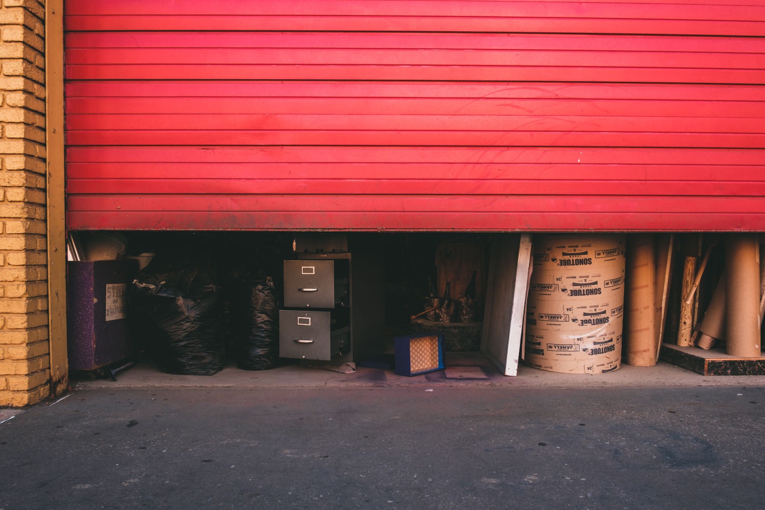
Other times Eggleston will shoot a straight photograph dominated by a colour to the extent of the image being all about it, nothing else. His most famous example of this is The Red Ceiling which is loaded and charged with violence. Three white cables meet a light-bulb in the middle, like thin slivers of white fat against blood, and then the black smudges, like something burnt to a greasy crisp. Its astonishingly powerful. A quieter instance of one of his colour mono-cultures is Brown's Custom Shop, a place that sells lino, all of which are that peculiar brand of 70's autumnal, in a building so brown and dowdy that its tepid colour seems to wash over the pavement below. It's as placid as Red Ceiling is menacing and its that sort of simple, plain, reduced, almost abstracted storefront that has attracted me many a time with my camera, not only in small American towns but at home, in Wales and the North of England.
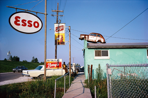
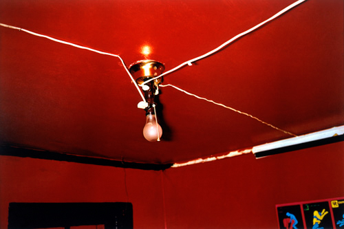
Above images by William Eggleston
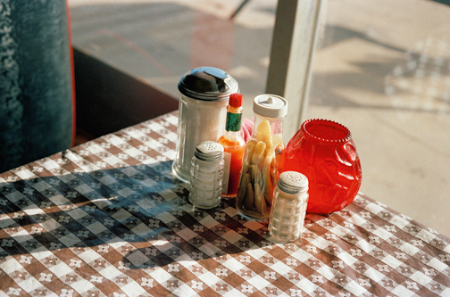
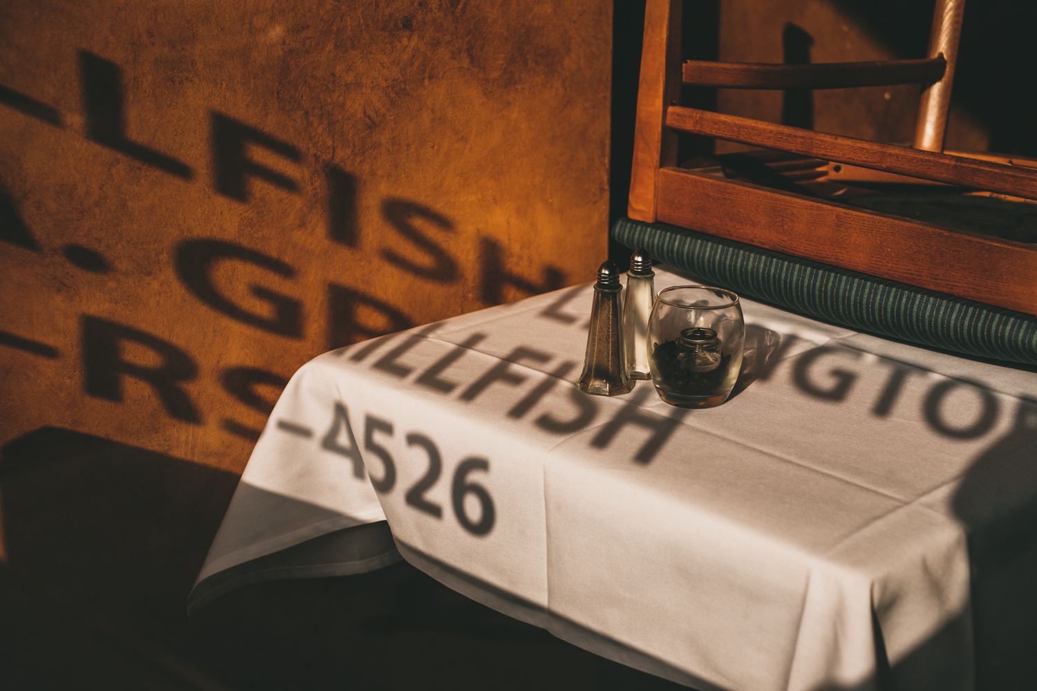
But we also have Eggleston's simple love for a rich instance of colour, elevating the mundane. Take a look at the candle holder and Tabasco sauce pairing on a diner table, both vividly red. Between them, a small bottle of chilies, which in the golden hour light have a little glow of their own. Surrounding them, the colourless cylinders of sugar, salt and white pepper. The white and red combination brings to mind the medical colours of a barber's pole, and with it don't those chillies begin to look like something else - something a bit weird? Maybe fingers? And the dark shadows of the various jars and shakers, don't they stretch out like a hand? Like most of Eggleston's photographs, what initially seems a random snapshot gets more beautiful, or more disquieting, the longer you look. And so rich are his colours, you can look a real long time. Look at them long enough, let them burn their way into your mind's eye, and when out there next, working a scene camera in hand - something might click.


It's not just colour There's great variation in black and white photography also, shifting the tone of images from tender and nostalgic to brutal and raw. Once you've absorbed the look of images, you can begin to dig deeper for intent, emotion and effect. So many photographers have their own emotional beats. For noticing in the mundane unexpected flashes of surreal humour you could look at Paul Russell and Matt Stuart. For electric emotion and poise in folk both rich and poor there's Larry Fink. For quiet grace and humanity Lee Miller. For tension and temperature Daido Moriyama. For those moments when you realise you are a living witness, Josef Koudelka. Black and white photography alone seemingly has infinite shades... the inky alienation - that feeling of being out in the cold - of Jacob Aue Sobol. The flat grey, at times hostile, banality of Garry Winogrand. All these photographers and hundreds more. Find which photographer speaks to you and then try to figure out where they're coming from, what they're trying to achieve.
Buy or borrow their books, attend their gallery openings, sometimes there's documentaries and talks on YouTube - they're not hard to find. It won't be long until you find you have photographers with whom you feel a sort of connection, a kinship. Then you can learn about their projects, what they were trying to say with their work - whether they were trying to change the world, condemn it or just quietly create work they felt had a special resonance for themselves.
Now rest assured I'm under no illusion that I'm even remotely in the same ball park as Eggleston and Leiter, or any of the above, but the question becomes, which of these thrill me and push me to see more? Knowing this, you can begin to turn your eyes to seeing more and more examples, and tune your vision to finding spontaneous manifestations in real life.
For me, when I see Eggleston's work I just find a burning desire to shoot colour. I love how the world looks after a heavy rainfall, under a cloudy sky. The slick glistening of tarmac reflecting the traffic lights. The incandescent yellow glow of a street light popping on under a dark gun-metal grey sky. The pale green of drawn shades in the window. An empty can of Coca-Cola in the gutter. I like that mix of colour and tone that implies stillness, of wandering quiet empty streets of an evening, in the charged hushed atmosphere before the break of a summer storm. When I was a kid I loved the children's picture books of Shirley Hughes. She painted kids playing in puddles, and leaf beds in autumn. Usually there was flat, cloudy light. I remember walking along a pavement to a party of a friend in Huddersfield, as a child. It's early evening, it's just finished raining and I'm holding a brown balloon. I'm fairly sure it happened, but I've never once to my certain recollection can ever recall having seen a brown balloon for sale in any party pack, nor at any party. Yet that odd, rich, chocolate colour looms large in memory. Did it really happen? Was it just a Shirley Hughes illustration taken root as false memory? Whatever it was, though illustrations primarily intended for children, her paintings still speak to me, and I'm always curious to try and recreate a flavour of that magic I found in her in her pictures of quiet streets, leafy parks and playgrounds and strangely coloured balloons under a lowering sky.
Point being, don't just leave it to photographers and film-makers - you can find inspiration anywhere. The more you take from that well of inspiration, the more you shoot what pleases and moves you in that odd little way, then the more your work begins to acquire a character and coherency of its own.


Though I'd been excited by Eggleston back in my Nikon days, it wasn't until I saw the shifting colours of a scene in my X100's electronic viewfinder when scrolling through the film simulations that I really began to realise what he was trying to do with colour. As the second and third generations of the Fujifilm X-Trans sensor came out, the original Provia, Astia and Velvia settings were joined by Pro-Neg and Classic Chrome, and I found myself beginning to obsess about whether the sky should be a sort of azure or a cyan. Flicking between my own images in Lightroom and the books scatted around me, I really began to start thinking about colour, about why a carefully judged photograph of a simple brick alleyway could look more fascinating and beautiful than a gaudy, ill-conceived image of a generic sunset. .Like I said in the previous Inspiration post, get creative with those named custom user settings and practise emulating the photographers that inspire you. Because once I figured out which photographers I felt spoke to me the most, once I'd absorbed the story they were trying to tell through their photographs, then I felt I could really begin to shoot images that satisfied me, images shot with purpose.
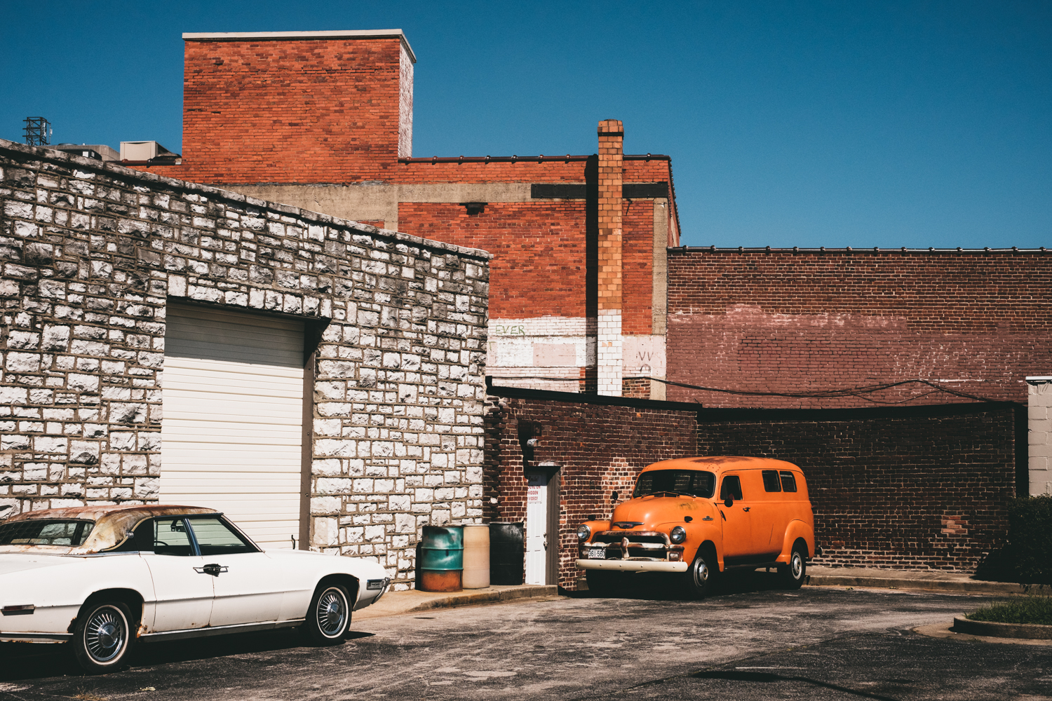
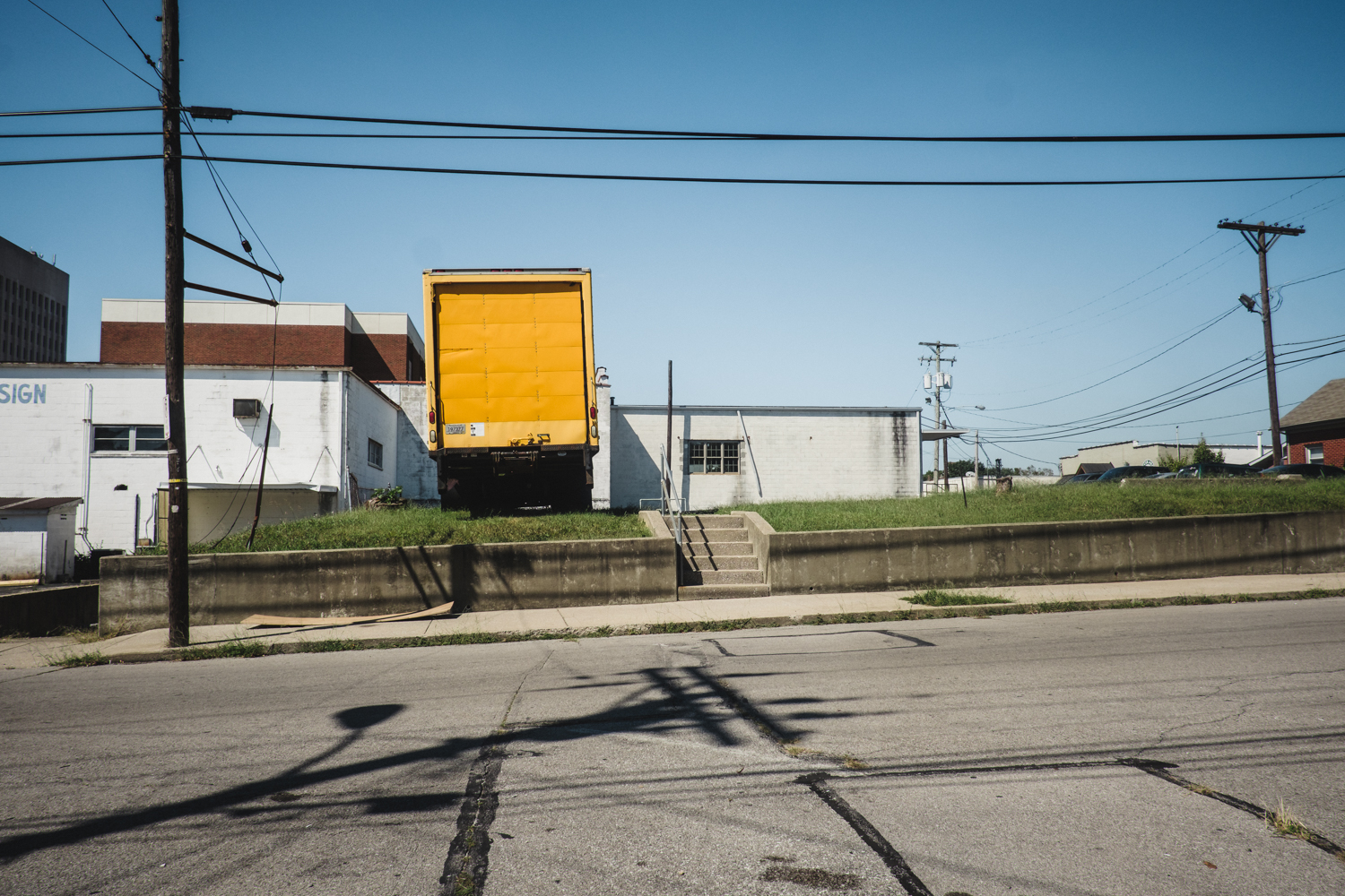
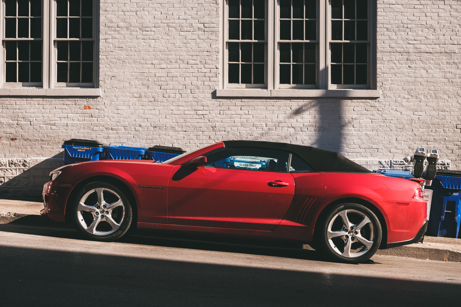
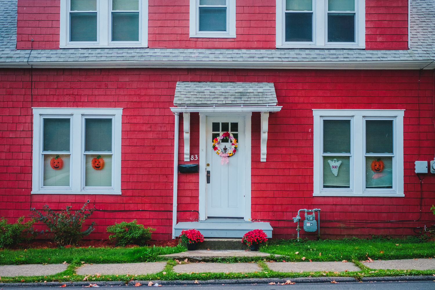
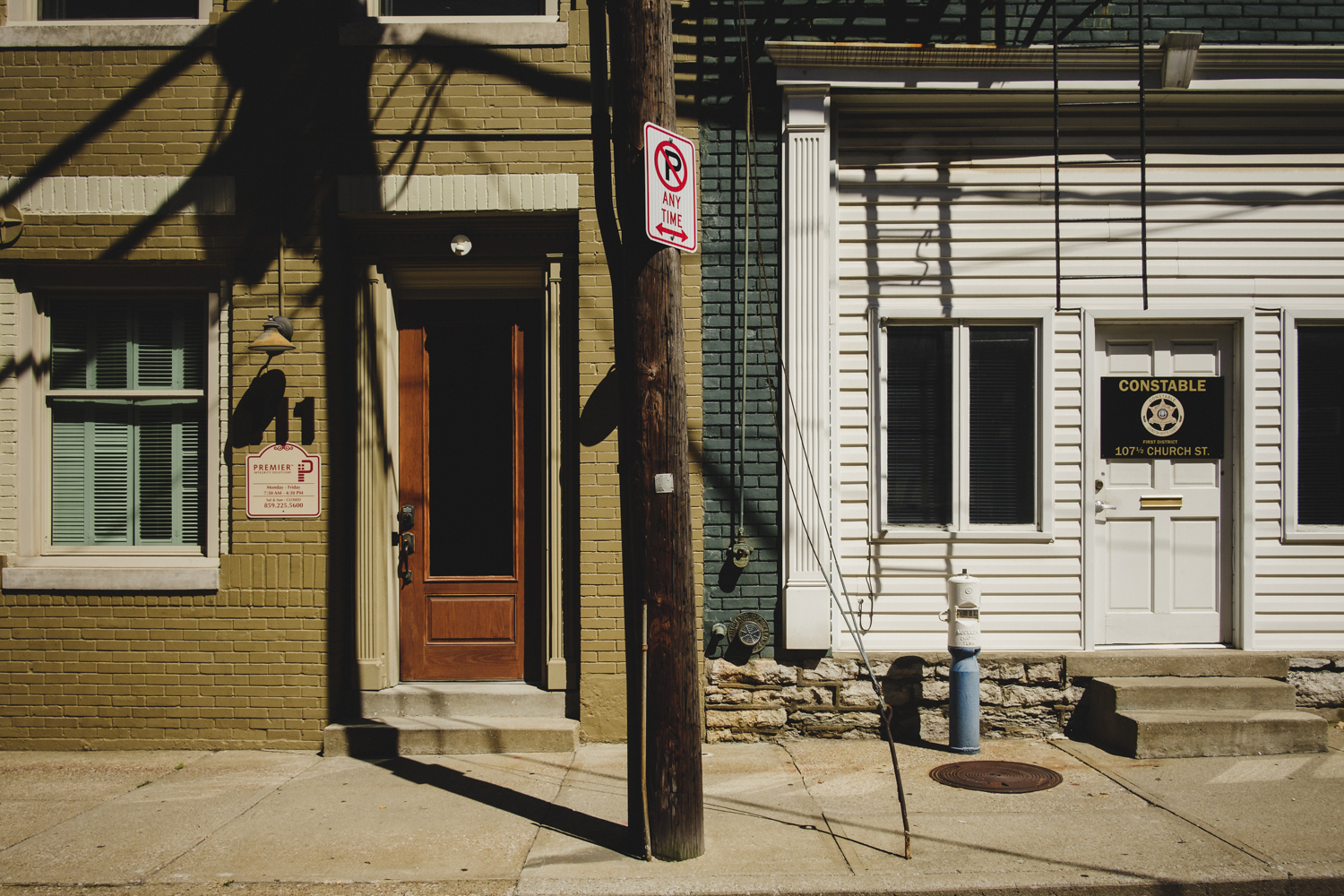
And that's the key to it, I guess. Shoot for yourself and shoot with purpose. It doesn't have to be a grand, world-changing purpose, just honest intent. Yes, for me, it was the reflection of traffic lights on the slick pavements. The splash of colour a clutch of balloons has against the greys and blues of a car showroom lot. The rich autumnal colour of a pumpkin in a dusty shop window. Those elements I pieced together to make a portrait of a small American town, tucked away in the hinterlands, one ignored by the world but which I felt had a strange sort of down-at-heel, other-worldly beauty, one that I wanted to commemorate.
Thanks for reading, if you enjoyed the post please don't forget to like or comment, and I very much welcome constructive criticism on my more rambling posts such as this one. For more examples of my colour work, check out a previous blog of mine... Fuji X Adventures in North America: Small Town Colour