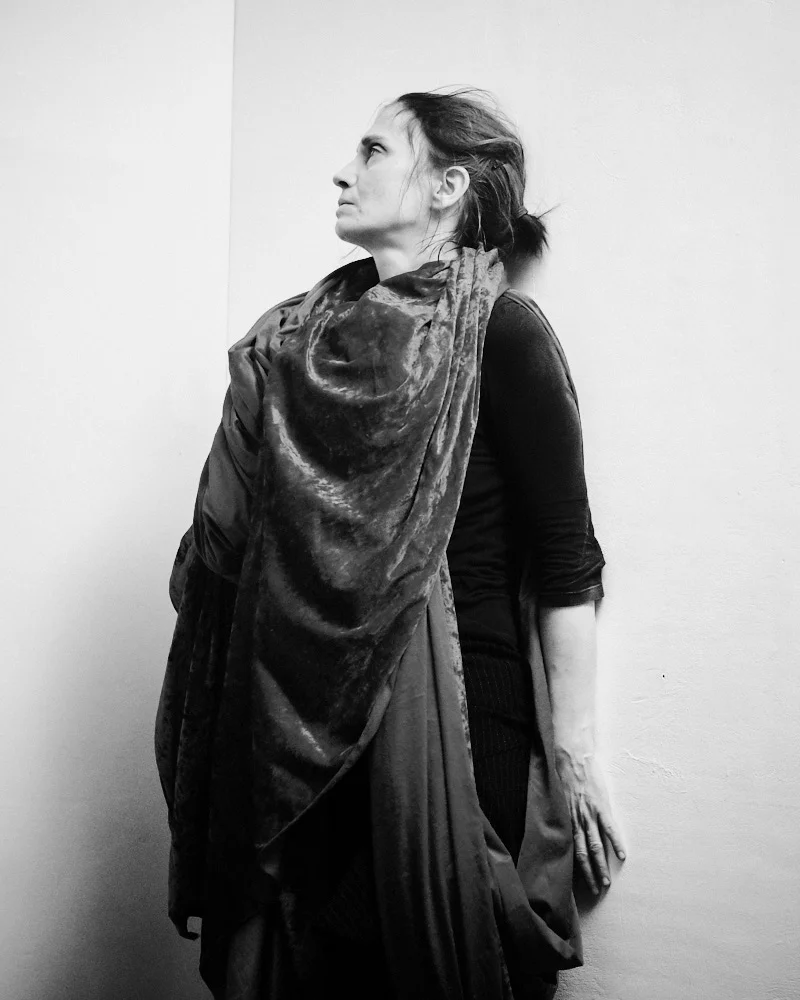
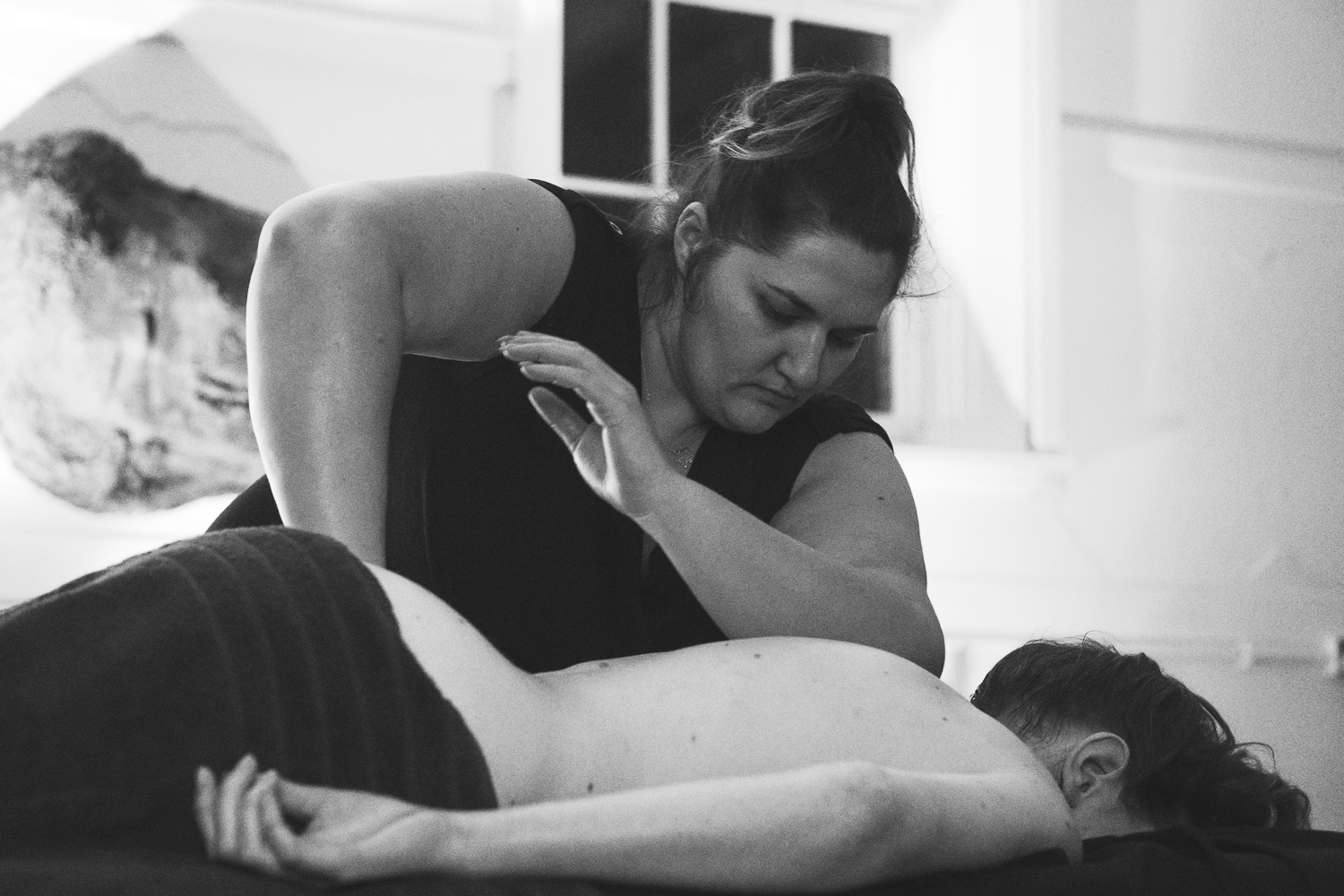
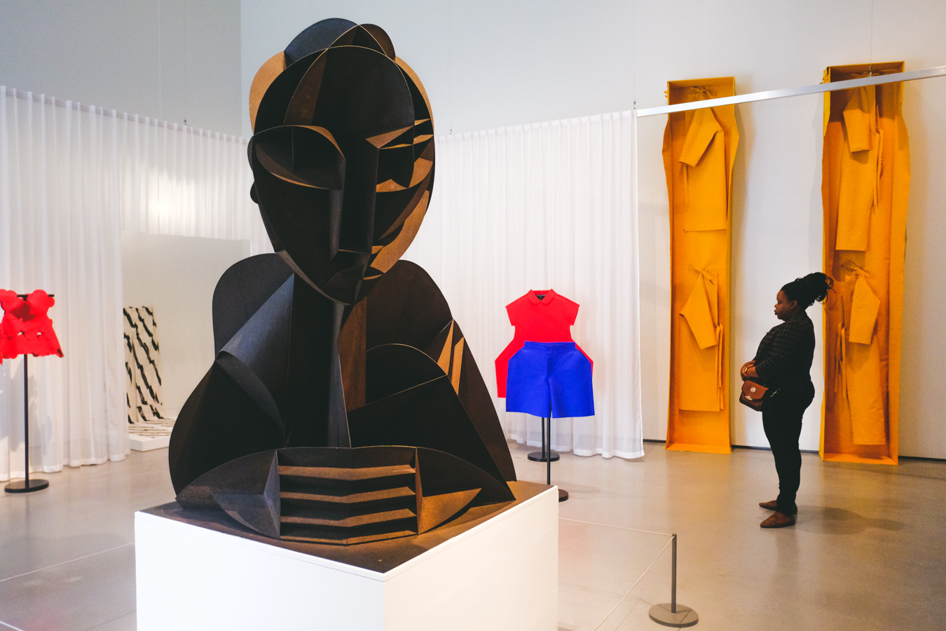
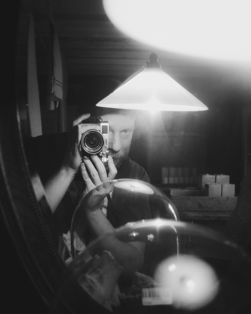
Images taken on the X-T3 with the 18mm f/2 and 35mm f/1.4 lenses


I’ve ever been conflicted when it comes to colour. Sometimes I feel I go too far in creating a mood, a false memory, pushing shadows and tinting skies… trying to evoke something that maybe was never there. I flick through my photography books and have my vision re-adjusted by the vibrancy of a Saul Leiter and begin to noodle away at past images…. trying to tease something out of a memory. It always ends the same way, I come back another night and look again and worry at how maybe I went too far, how I should dial everything back, try to ground everything in digital reality. Mostly, I wind up some place in-between and lean towards the rich look of the first true wave of colour photography - the straight topographical documentary work of Joel Sternfeld, William Eggleston and Stephen Shore and the rich colours and plasticity wrought by those early low speed Kodak slide films.
Recently I made the jump from Lightroom to Capture One, and I’ve become rather excited at the opportunities afforded by the powerful colour editing tools contained within… and rather daunted. There’s even more possibility for confusion and second-guessing now. One thing has struck me though… I’m not shooting documentary work, I’m taking a photograph to try to find something heightened, something beautiful in the commonplace. I’m finding that I want a certain plasticity, a colour and a mood to my images. Not to the extreme almost graphic-design extent of Harry Gruyaert or Saul Leiter, but again in that rich Kodak memory way, trying to make something cinematic of the mundane. I’ve always loved both the dream-like splendour of technicolor - especially in the Powell & Pressburger films such as The Red Shoes and A Matter of Life & Death… but I have a huge love too for that dark, moody, autumnal aesthetic of the downbeat American movies of the seventies, found in such works as Badlands, Charlie Varrick and Being There. The sweet-spot for me probably confusingly lies somewhere in-between, trying to apply the viewpoint of a hopeless romantic to banal, slightly depressing scenes. To quote Mervyn Peake, “I’d paint a dustbin if I found it beautiful.”
I used to create a lot of presets in Lightroom, nearly all of them based upon the looks of photographers I love. The difficulty in applying them was that frequently they were too much, especially when applied to JPEG images. What worked in enhancing a cloudy afternoon became overkill in a photograph shot in the golden hour, and although I was very happy with the intuitive simplicity and cataloguing of Lightroom, I was beginning to hunger for more control. There was always the option of getting Adobe Photoshop, but that would have meant getting a subscription… and as I mentioned in my previous post I was somewhat unhappy with Adobe’s recent business practices.
Enter Capture One. Happily with Capture One you can apply presets - now called ‘styles’ - to a layer, and in turn you can adjust the opacity of that layer. What this means in practice is that you could apply a style with a gradient filter to the lower portion of a landscape and dial back the strength until it balanced nicely with the sky. You could then follow up by adding even more styles in radiant filters, brushes and whole washes to the image. An set of tools both powerful and subtle indeed but… well… one can see how easy it would be to fall down the rabbit-hole with such dangerous freedom.
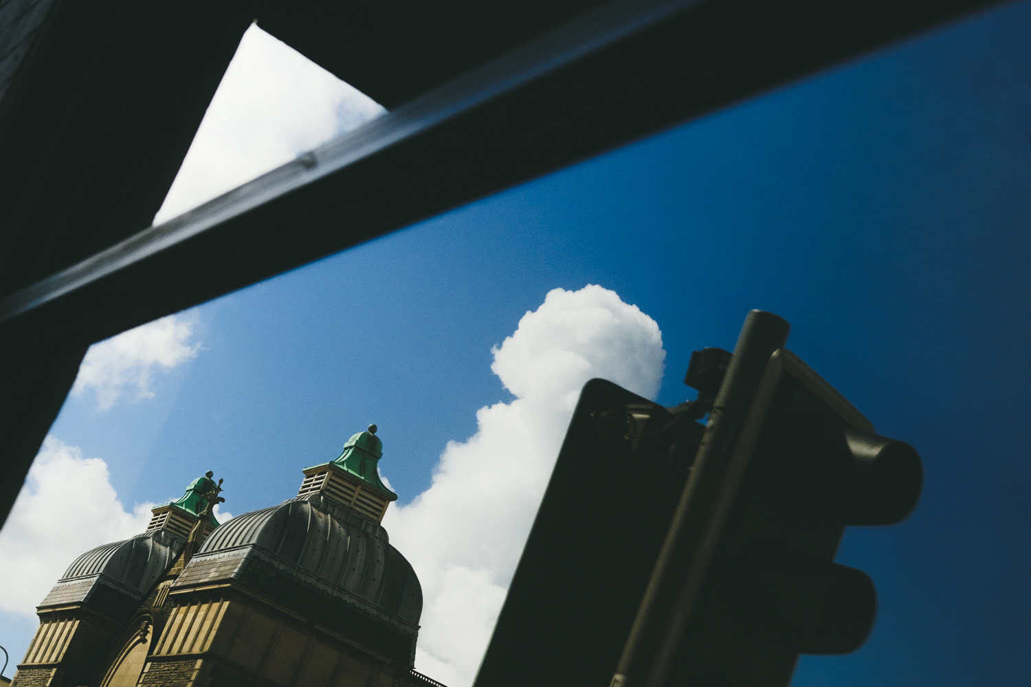
So I’m taking it slowly with Capture One. I’ve decided to experiment first with JPEGs rather than RAW files, imposing a base layer of limitations upon myself and further tying myself to the in-camera custom-profile film-simulations I created a couple of years back for inspiration. You can read about those on this page here. Another reason for shooting in JPEG was so that I could use the Colour Chrome effect found in the new wave of cameras such as the X-T3. This adds a depth and richness to the colour that is a pleasure to work with, providing you exercise restraint in post-processing when it comes to saturation. A hop onto the Great Western Railway for a day out in Oxford visiting the Pitt Rivers museum provided me with ample opportunity to play with colour, light and shadow. I hope you enjoy the results.


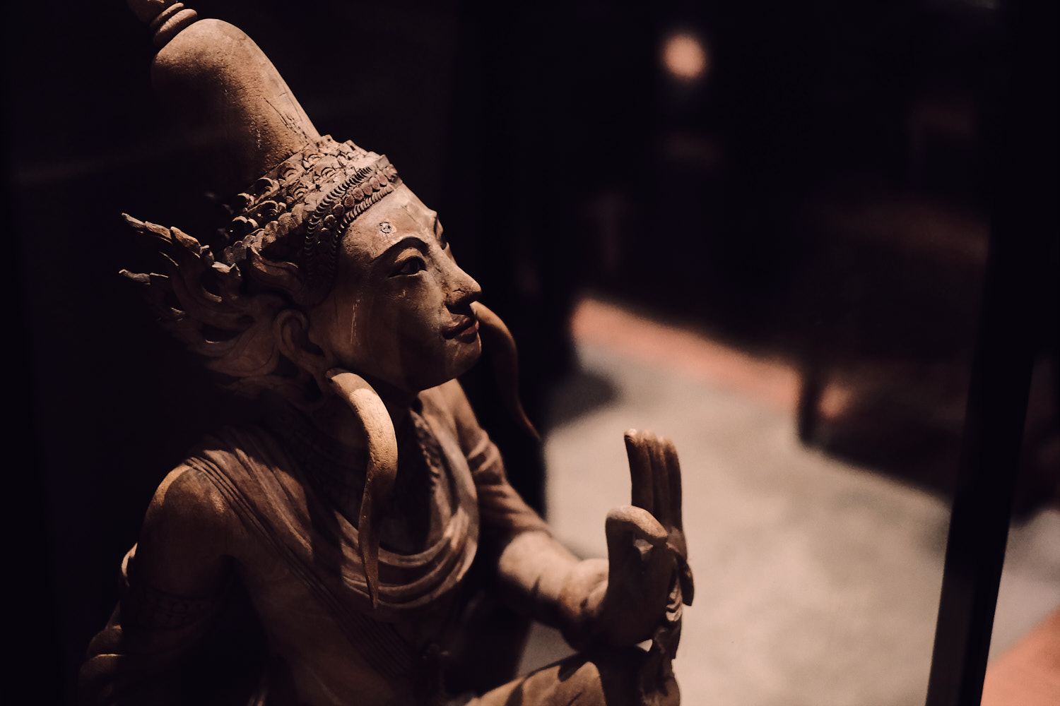


The amount of stuff in the Pitt Rivers museum… the combined haul of several centuries of global exploration, trade and possibly the odd bit of thievery… is pretty much overwhelming. My eyes began to rebel a mere hour into combing the many floors for sights and wonders. It was certainly a good work-out for the Velvia Bulmer setting I had stored in my camera, based upon a film simulation that had proved more versatile than I was expecting. In my processing I opted to really darken the shadows and add a slightly warm tint to many of the images to unify the colours a little more, which along with a boost in noise-reduction and tweaking of clarity helped a little in creating that more film-like plasticity, even if it departed from reality a little.
In the coming months I’m going to be combing through a lot of my American road-trip using Capture One, seeing if I can finalise that signature style. There’s going to be a fair bit of experimentation involved, and I pray I can settle down with a unifying look for my work both abroad and at home. As part of this journey I just know I’m going to come to rely a lot on the inspiration and knowledge provided by Patrick LaRoque, who is embarking upon a series of posts regarding processing images in Capture One. You can find the first part in his useful guide here: Capture One - On Colour and Interpretation
His guide was a great starting point for these edits and the information he provides on the advanced colour editor alone is pure gold. For myself, I hope this post shows you just how far you can process JPEGs. They are far more flexible than their reputation would have it, and the richness of those Fujifilm film simulation colours really play well with the program. The folk at Capture One have a long-running 50% discount going on both the Fujifilm and Sony version of their Capture One Pro. I’m not sure how long it’s running for but you can get the program from their store here: Capture One Store
They also have a free ‘Express’ version that will allow you to do quite a lot, and the trial is fairly generous, so why not give it a go and see how it flies? In the meantime I’m off to stare some more at a whole bunch of sliders, dials and buttons until my eyes go funny. Thanks for stopping by, and if you’ve any queries or comments please feel free to pop them below. I’d be happy to answer any questions regarding how I work Capture One, even though I’m still trying to work it out myself.
Oh and for fans of black and white, don’t worry, I still worship at the alter of Acros.