Don't you wonder sometimes - about Film & Vision? Blue blue Velvia blue! That's the colour of my room - that I will shoot. Blue blue.
Acros shot all day! Something to shoot, something to...
("Stop this," - ed.)
And once again Fujifilm have kindly released some new firmware that makes my camera feel new again. Faster auto-focus, preset continuous-focus options, voice-memo option, faster face detection, new display options... yup, there were indeed quite a few exciting new updates to the X-Pro2 with the release of the version 3.00 firmware a few weeks ago. For me though the most exciting feature is, on the surface, one of the most prosaic... and that's the ability to rename our custom image settings. Yep, no longer did I have to try to remember if it was option C5 or C7 for soft portraits, now I could put a proper name to it... and that got me thinking... it got me thinking if this finally was the time to double down, ditch RAW, and go all in on JPEG...
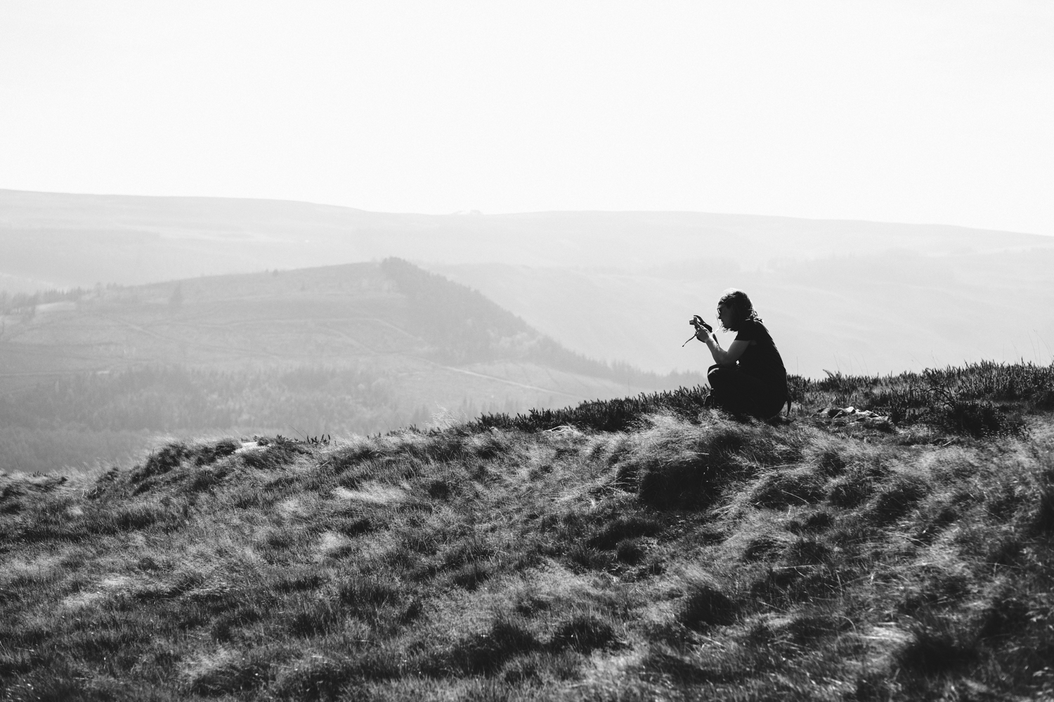
Photographs taken with the X-Pro2 and 16mm f/1.4, 35mm f/1.4 and 50mm f/2
Images Straight out of Camera with a tone curve added in Lightroom


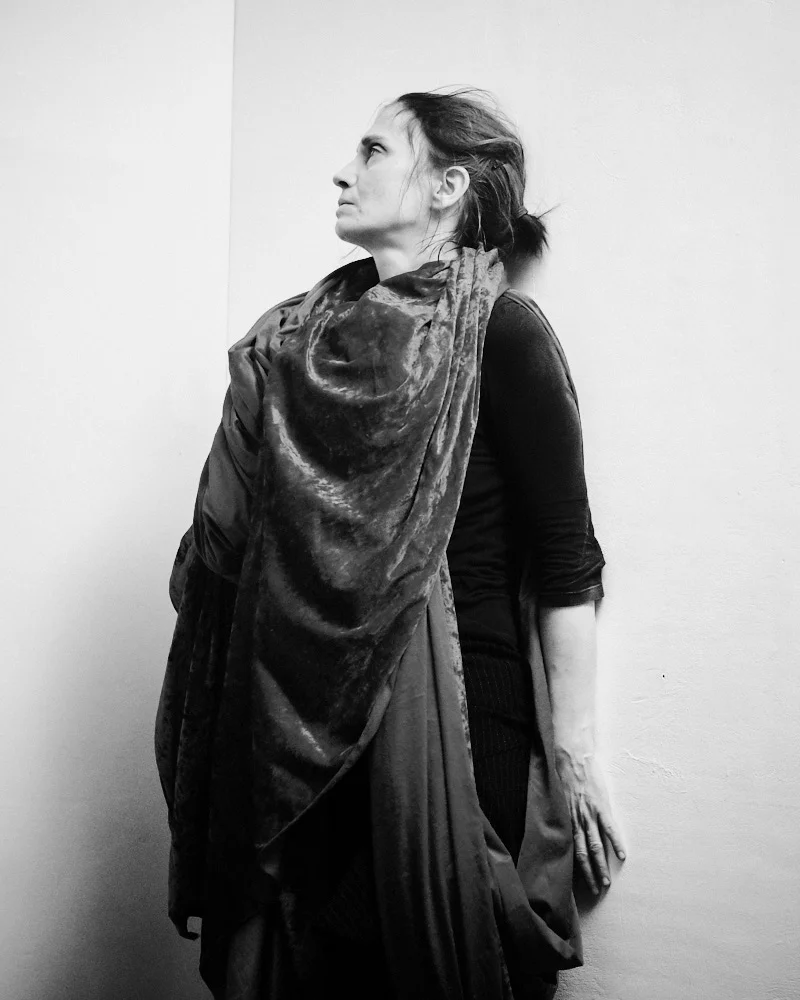
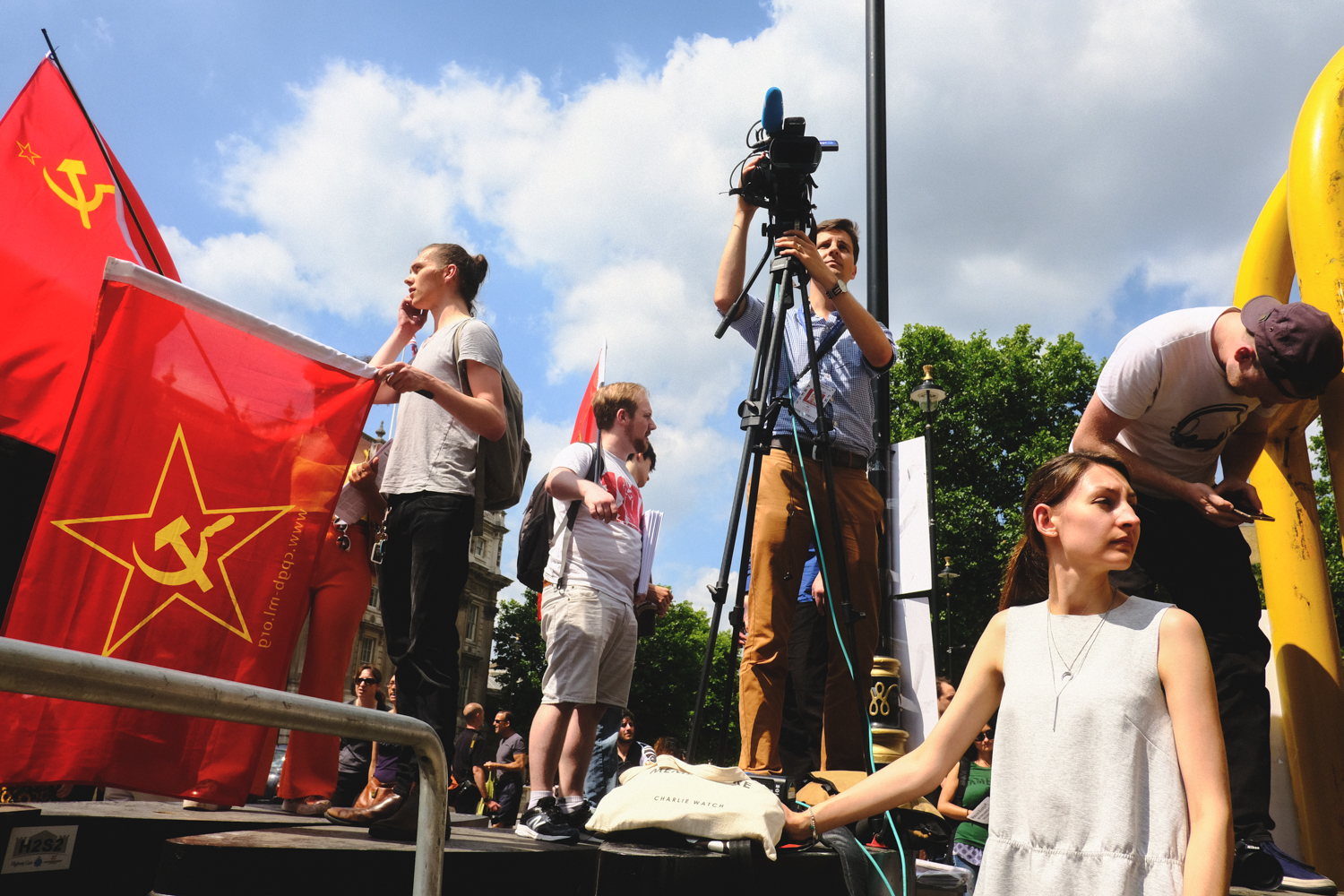
Above images shot with the Velvia Bulmer setting. Film curve in Lightroom.
For those not in the know, one of the big reasons why people are drawn towards the Fujifilm X series is all down to the wonderful variety of film simulations embodied in the camera. The same colour scientists who worked on the old Fuji films now labour to bring us the look of Velvia, Provia, Pro-Neg and others in digital form. Normally, photographers like to have the flexibility of the RAW file. You can endlessly tinker with the 'digital negative' to get the look you want, unlike a straight-out-of-camera JPEG. It's the difference between developing your own film negatives in the darkroom and trusting everything to the lab-coats at Boots Chemist for that final print. But the way the Fujifilm cameras handle JPEGs, they create something extra-special straight out of camera and... to be honest... I found myself spending increasing amounts of time in Lightroom trying to get the RAWs to look like the JPEGs.
So why not just shoot JPEGs?
Before the third-generation X-Trans III sensor found in the X-Pro2 I toyed with such an idea time and again but always abandoned it. You see up to now It's been something of a struggle for those hard-working Fujifilm colour technicians. The Velvia simulation for one in the older generation of Fuji X cameras looked horribly garish to my eyes, whilst the company never seem to have been able to quite fully recreate the magical beauty of the Astia and Provia simulations found in their first proof-of-concept camera, the original X100. However it now appears to me that they've largely cracked it. Not only is the colour depth richer now, with a smoother gradient, but they've developed a very nice grain engine to go with it. The film simulations respond to how you work the highlights and shadows and what noise sensitivity you're shooting at... and thus you get a more natural and, well, more filmic look.
So it was settled. Aside from critical back-ups for weddings and important projects, it'd be purely JPEG for me from now on, with just a little tone curve tweak and a bit of dodging and burning and selective sharpening now and again in Lightroom. I was excited. But so many film simulations, where to begin when out shooting? I mean, it's all very well finding your look in Lightroom, but in the field you don't always have the luxury of time to ponder, and whatever look you choose to shoot you're stuck with...
And then it struck me, the root of the creative crisis I'd been having recently.
I'd been stressing again and again about trying to find a consistent look. I'd been straying so far into the wilderness in Lightroom, endlessly playing with presets and sliders and RGB curves that I'd no longer been able to really SEE the images I was processing. Consequently I was heading out and shooting but with no real goal in mind, no real conception of the look I was shooting for. Sure, I could shoot with the electronic view-finder and a film simulation dialed in, get some immediate feedback that way as to how my colours and shadows and everything were being affected - but returning home and feeding the RAWs into Lightroom I immediately lost all of that. The image became a flat digital negative and I was back to labouring with sliders and presets, not always sure what the essence was of what I'd tried to capture in the first place. But then suddenly, with the release of the firmware adding the ability to name your Custom Film Settings, a flash-bulb popped in my mind. (Ouch.)
Every month or so I buy a new book by a great photographer. Henri Cartier-Bresson. Mary Ellen-Mark. Joel Sternfeld. Shomei Tomatsu. Eve Arnold. Philip Jones Griffiths. David Hurn. Don McCullin. Gordon Parks. Lee Friedlander. John Bulmer. Vanessa Winship... the shelves are beginning to creak a bit now. Each of these photographers have a unique vision. They also all shot film. They'd finish breakfast, pick up their camera with a project in mind, fill their pockets with the film that they felt best captured the truth of what they were shooting and hit the streets, fields and studios. They shot Kodak and Ilford and Fuji and Agfa. Give two photographers the same film and they'd come back with completely different looks. They shot with purpose. And so...
I look ahead to the day's shoot and think to myself... you have two types of film in your pocket. You're allowed two presets. You can tinker a little on the spot, sure. Pull the highlights back a little here, deepen the shadows a little there - but ultimately, you're to think ahead of time as to what you want your images to look like. Time to choose...


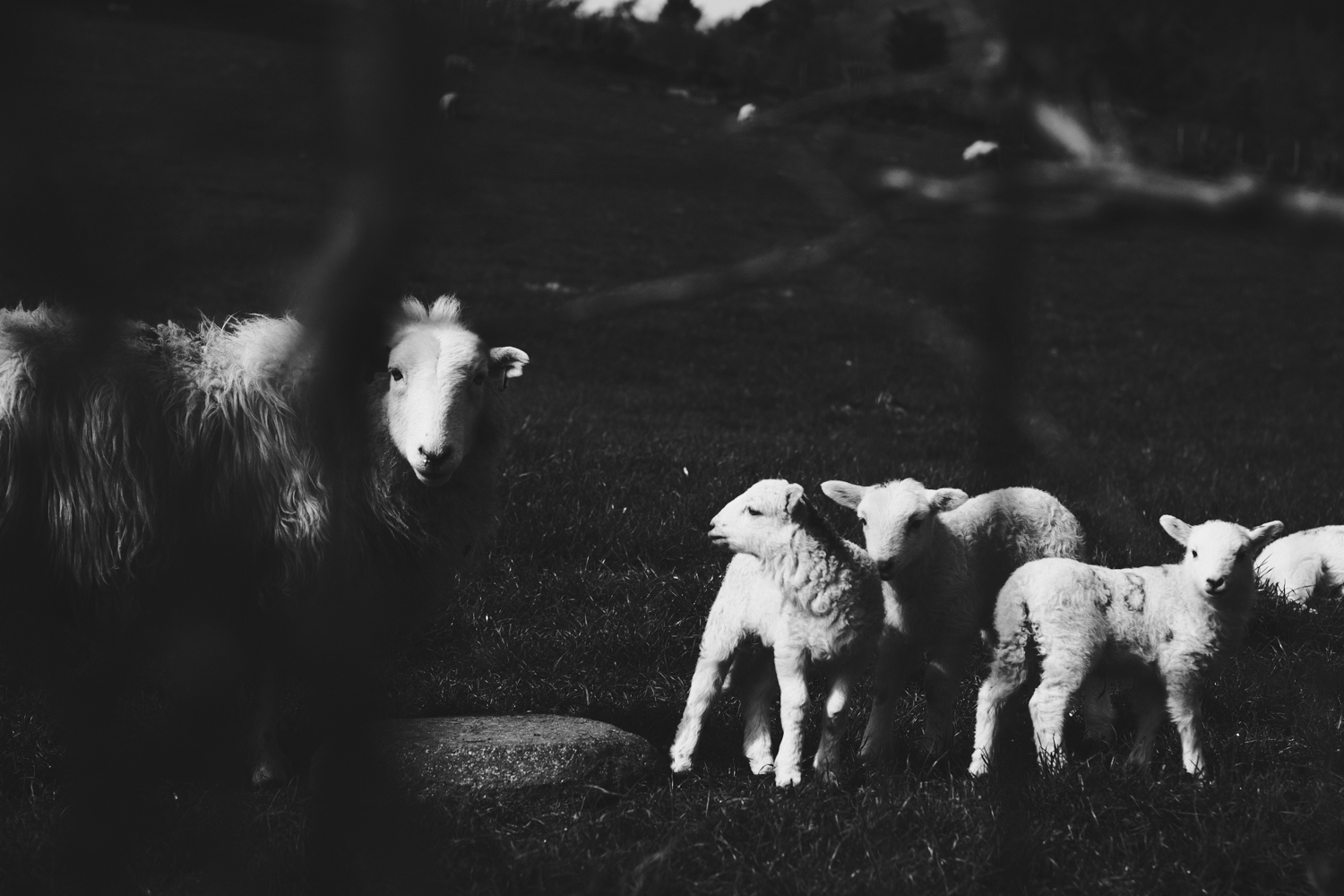


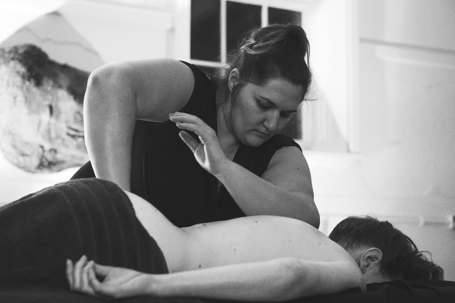
Above images shot in Acros Ellen Mark and Acros Moriyama. Film curve in Lightroom.
Now first off let me get this straight. These settings aren't the bottled magical substance of the photographers listed, rather they're guides to how I should be approaching the shot. All simulations are set to DR: AUTO, Noise -3, Grain: Off and Sharpness -1 unless stated otherwise.
Chrome Eggleston
Origin: Based on William Eggleston's sombre but beautiful rich colour work using the old Kodachrome.
Intent: Whenever I want a rich, warm and nostalgic feel, this is the one to go for. Also surprisingly good for dystopian brutalist architecture. A good all-rounder.
Film Simuation: Classic Chrome
Grain Effect: Off
Highlight Tone: +2
Shadow Tone: +2
Colour: -2
Provia Sternfeld
Origin: Designed to have the colours matching reality, with low contrast. Matches the sort of look used in the New Topographics movement that Sternfeld helped pioneer.
Intent: Capturing that oddly beautiful banality of empty urban spaces.
Film Simulation: Provia
Highlight Tone: -2
Shadow Tone: -1
Colour: -3
Acros Ellen Mark
Origin: That beautiful B&W documentary 35mm work that Mary Ellen Mark was famous for.
Intent: The go-to Acros simulation. Perfect for documentary, portrait and fashion.
Film Simulation: Acros Yellow Filter
Highlight Tone: +2
Shadow Tone: 0
Acros Moriyama
Origin: Based on the look that now legendary Japanese street photograph Daido Moriyama was famous for.
Intent: Anything grungy, raw and primal from gig photography to night-time urban. Also a wildcard for any situation to jolt me out of complacency.
Film Simulation: Acros Red
Dynamic Range: DR100
Highlight Tone: +4
Shadow Tone: +4
Acros Winogrand
Origin: Great American street-photographer who documented the increasing conformity of 70's suburban America.
Intent: Going back in time using a machine to document the increasing conformity of 70's su... no, wait. Er, not sure. But I've always loved Winogrand. Urban street work in good light.
Film Simulation: Acros
Highlight Tone: -2
Shadow Tone: -2
Pro Neg LaRoque
Origin: Known mainly for working the Classic Chrome and Acros, Fujifilm X-Photographer LaRoque is something of a modern inspiration for me and my blog. He once knocked my socks off with what he did with a series of very soft, slightly ethereal Pro-Negative portraits, which I'd never considered before.
Intent: Portraits. Also a flat profile to work off if I ever want flexibility with a base of great skin tones and colour accuracy.
Film Simulation: Pro Negative
Grain Effect: Weak
Highlight Tone: -2
Shadow Tone: -2
Colour: -1
Sharpness: -4
Velvia Bulmer
Origin: I don't think John Bulmer, the great British photographer, ever actually shot Velvia. But his inventive documentary colour work possessed a remarkable vibrancy.
Intent: Bulmer's Northern industrial scenes remind me that Velvia isn't just for the Steve McCurry jaunts through India, but for really bringing out spashes of colour in otherwise dour scenes - hence mainly urban shooting with a bit of nature when all the colour isn't too overpowering.
Film Simulation: Velvia
Grain Effect: Weak
Highlight Tone: -2
Shadow Tone: +2
Colour: -2
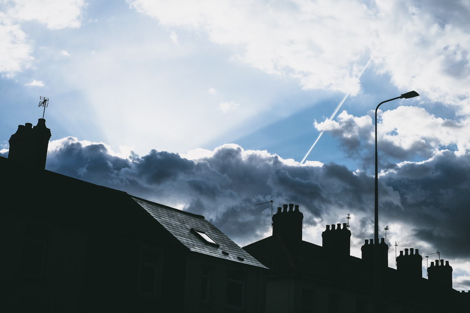


Above images shot in Chrome Eggleston and Provia Sternfeld. Film curve in Lightroom.
It may seem a little arrogant, invoking these names. Honestly, I don't think I'm anywhere near their level. But what it does provide is an idea as to what to shoot for. For example, it's a rainy summer's Saturday night in the city. I'm working a project on nightlife on the streets. I reckon Daido Moriyama has the right idea - inky blacks and clipped highlights. And I stick with that look, for the duration of the project. These custom titles are little messages to myself, when I raise the camera and scroll through them, wondering... what if I shot the nightlife like John Bulmer shot gritty Northern industrial landscapes? What if I shoot the beauty of the Gower Coastline like Daido Moriyama shoots the city streets of Tokyo? It becomes an exciting question, one as equally valid as wondering what lens to screw on the front of the camera.
I'm sure not all of these custom settings will stay the course. I find myself barely resorting to Acros Winogrand, finding it difficult to match to what I'm shooting. On the other hand I've surprised myself a lot by shooting so much Velvia Bulmer, as Velvia was hitherto my least favourite simulation. Go figure. But I'm really looking forward to exploring where this takes me. I'm even more intrigued as to which of these will become my favourites. Perhaps even by the end of the year I'll have fixed myself on one setting, to the exception of all others. Who knows?
Have you taken to crafting your own custom settings? Do you have a photographer that you like to emulate? What are your favourite settings? Or are you wedded to the practicalities of RAW shooting? Please feel free to leave a comment below, I'd be intrigued to hear.
Happy shooting whatever your vision.
Pete